This industry perspective is by Uzra Khan, vice president of editorial and audience growth at 50000feet.
When building a brand, most designers and marketers focus on the usual suspects such as design, color palettes, typography, and imagery. Voice and tone often make the list, too. But punctuation rarely gets a second thought. Yet punctuation is one of the most powerful, underused tools in a brand’s toolkit. A single mark can shift tone, spark emotion, or create surprise. And it can do all that in just a few characters.
Consider the difference between these three messages.
I’m sorry. I love you.
I’m sorry! I love you!
I’m sorry I love you
With only minor differences in punctuation, the three have conveyed very different feelings. One is serious, weighty, and considered. The second is lighthearted, maybe even joking. The third may be interpreted as harsh, passive-aggressive (or just carelessly lacking in punctuation and written in a hurry).
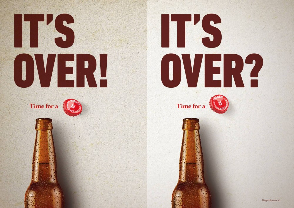
This plays out in the world of brands and brand messaging, too. Take this ad from Gegenbauer beer in Austria in 2016, for example. A single choice of an exclamation mark over a question mark or a period imbues the ad with a completely different emotion and meaning, and therefore a different brand message. The choice can dramatically change how consumers perceive the brand: is it an exuberant partner in joie de vivre, or is it a measured companion in life’s more challenging moments? An optimist or a realist?
Images from: https://www.adsoftheworld.com/campaigns/score
Brands like Yahoo! and Jeopardy! embraced the exclamation mark in order to imbue the brand with enthusiasm, fun, and positive energy. Those single marks do a lot of heavy lifting; it’s hard to imagine the brands without them, as they have become iconic emblems of what Yahoo! and Jeopardy! stand for. It is important to note here, however, that exclamation marks should not be used gratuitously for any brand looking to convey positive energy to its audiences; when overused, they run the risk of coming across as frivolous or trite, and need to be carefully considered as part of a full brand platform and identity.
Case is another lever in the brand toolkit. Brands like adidas, facebook, and amazon (the latter two in their earlier days), embraced all lowercase names, ostensibly as a way to signal accessibility and friendliness. Uppercase and title case can connote a certain conformity to norms, severity, or formality, and in abandoning them, these brands demonstrate a rejection of those characteristics. There is a softness in the design of lower-case words that eschews the sharp angles of the title case, and can feel more inviting; an antidote to ALL UPPER CASE, which can feel aggressive and loud. These choices tend to signal who brands are speaking to, too, with many of the qualities of lower case being particularly appealing to younger audiences. This is a trend that continues today with Gen Z. According to Nielsen, Gen Z spending power is projected to reach an estimated $12T by 2030 — the cohort has a significant influence on the products manufacturers and retailers will sell in the near future, and therefore their preferences should impact brand decisions.
Spacing is another punctuation-adjacent tool to play with. Many brands’ names are portmanteaus (for example, Microsoft from “microcomputer” and “software,” Netflix from “internet” and “flicks,” and Comcast from “communications” and broadcast”). Some brand portmanteaus are clearly and obviously represented through a combination of title case and strategic spacing. For example: PayPal, FedEx, and LinkedIn. In each, the lack of space between two recognizable words or parts of words is a nod to eliminating friction that is a part of all three brands’ promises to their customers. These brands also demonstrate a comfort with the digital era, where spacing in URLs and hashtags is of less significance, and therefore an inherent futurism.
As you think about how to bring your brand’s personality to life, consider punctuation choices as a subtle but sophisticated tool in your toolkit. Punctuation can dramatically shape how audiences consume your content, and therefore is a valuable lever to convey emotions that are hard to communicate in limited space. Ask yourself: If my brand were a person, what would it sound like? What kind of texts would it send to its friends? What would its most-used punctuation marks (even emojis!) be? The answers to these questions may not make it into the external-facing brand system, but they are instructive in building a unifying tone across all your brand’s platforms.
Brand strategists should consider that punctuation is an intentional choice alongside traditional elements like color, images, logos, and typography. In an increasingly crowded marketplace of brands looking to carve out a distinctive niche, small punctuation choices can make all the difference and evoke your brand’s true qualities without changing a word.
Uzra Khan leads a team of journalists, editors, and newsroom strategists at 50000feet, where she is the vice president of editorial and audience growth. This team uses the editorial approach of a modern media organization to help brands tell their stories, explore big ideas, and build long-term relationships with their audiences.
Header image by Aron Yigin for Unsplash+.
The post Punctuation Speaks Volumes for Your Brand appeared first on PRINT Magazine.