If you came of age in the ’80s, you didn’t just witness the rise of pixel culture, you engaged with design in its rawest form, where every unit on the grid had to earn its place. Boxal taps directly into that legacy, reframing it as a typographic time capsule—now with the luxury of considered kerning.
The latest release from The Northern Block unfolds with a kind of quiet voltage—reminiscent of a CRT screen warming up. Designed by Jonathan Hill, Boxal doesn’t simply reference the 1980s; it situates itself within the visual and cultural language of the arcade era, where typography, sound, and motion coalesced into a distinctly immersive experience.
For those who remember it firsthand (and, like me, saved their quarters for the arcade after a long stretch in the campus library), this register feels familiar. There was a time when “graphics” meant witnessing form emerge incrementally, pixel by pixel, on screens that were as substantial as the machines themselves. Loading wasn’t an inconvenience; it was part of the ritual.
Boxal captures that sensibility with precision. Its letterforms draw from the visual cadence of early arcade titles. Think Tron, Galaga, Donkey Kong. Does anyone remember Elevator Action? There’s an immediacy to the forms, but also a deliberateness that reflects the constraints, and ingenuity, of early digital design.
What distinguishes Boxal, however, is its refusal to remain purely referential. Where early pixel typefaces were bound to rigid, monospaced grids, Boxal introduces proportional spacing, allowing characters to relate more fluidly. The effect is subtle but meaningful: a system once defined by limitation is reinterpreted with contemporary nuance, enhancing both readability and expressive range.
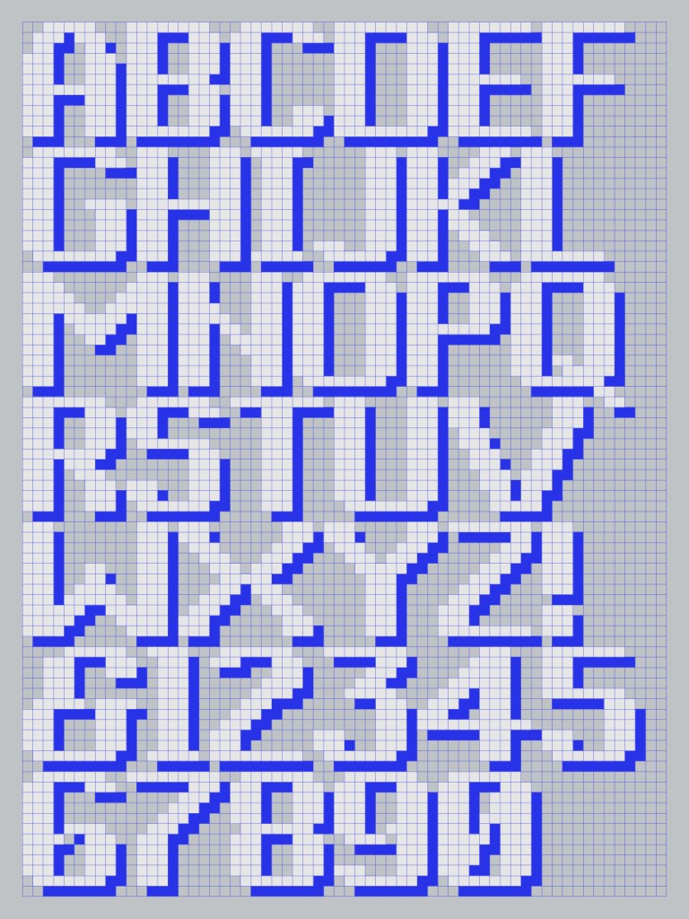
The typeface extends this flexibility through five variations—Normal, Diamond, Dot, Square, and Line—each offering a distinct interpretation of pixel construction. Rather than static nostalgia, these styles suggest an adaptable toolkit, capable of shifting tone from restrained to expressive without losing structural coherence.
Perhaps most compelling is how familiar the underlying system remains. Pixel-based typography has never truly disappeared; it persists in the interfaces and devices that shape everyday life. What Boxal does is bring that visual language back into focus, foregrounding the grid as both a historical artifact and a living framework.
For designers who came of age alongside early digital media, this is less a revival than a recognition. Pixels were never simply aesthetic, they were foundational. Boxal revisits that foundation with clarity, offering a contemporary lens on a formative moment in design history.
So yeah, the ’80s are back (again, again). But this time, they’ve got range. And Boxal proves that even the smallest building blocks can still hit like that high score you never forgot.
Foundry: The Northern Block
Type Designer: Jonathan Hill
Creative Lead: Donna Wearmouth
Release Date: March 2026
Weights: Light, Regular, Bold
Styles: Normal, Diamond, Dot, Square, Line
Single Weight: from £18.95
Full Family: from £99.95
The post Quarter Drop: Revisiting Arcade Typography Through Boxal appeared first on PRINT Magazine.