Typography legend Jim Parkinson passed away in June. This profile by Sean Elder is from an interview conducted earlier this year—and here, we’re publishing it in honor of Parkinson’s deep legacy and inimitable craft.
Jim Parkinson was honored at San Francisco’s Letterform Archive earlier this year. Older bookbinders and young graphic designers came to eat roasted chicken and drink white wine amidst the stacks while Parkinson, best known for the typeface and logo he designed for Rolling Stone in the ’70s, looked like he’d rather be anywhere else. At 75, the artist still has the air of the outsider about him, as if he’d just crashed his own party.
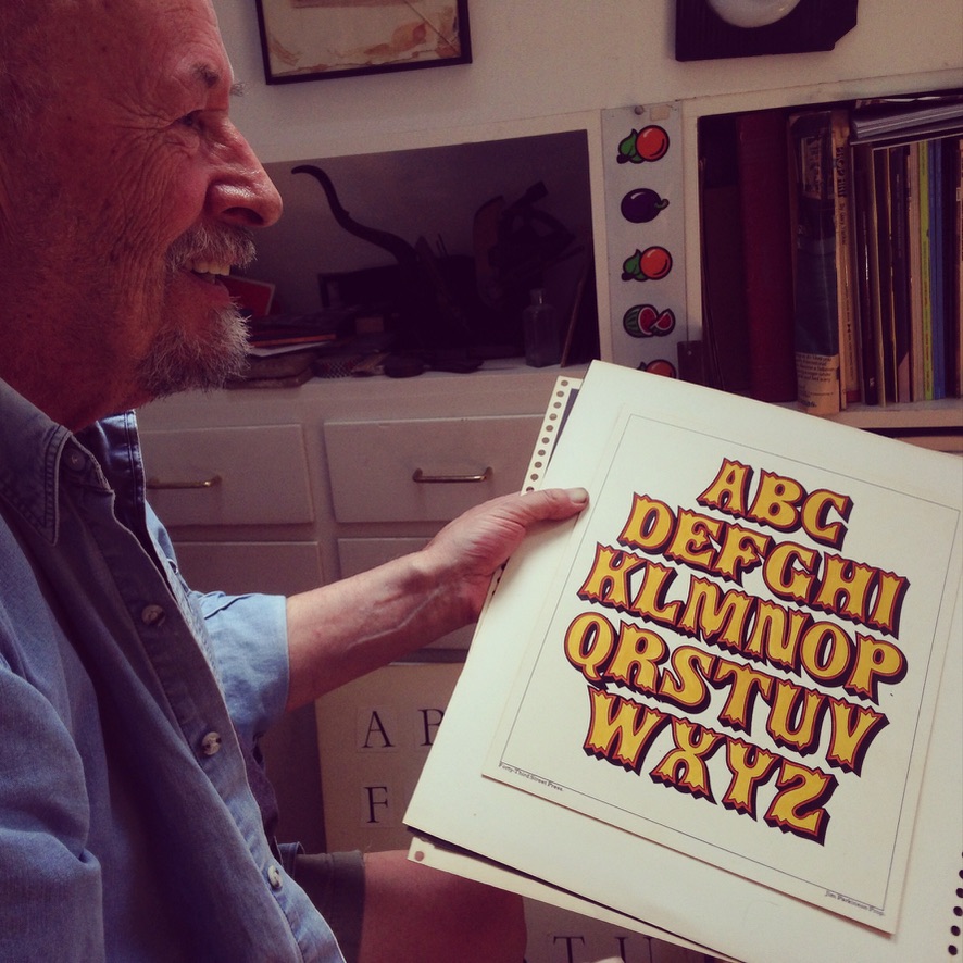
Photo by Stephen Coles
When I met him at his home studio in Oakland a few weeks later, he showed me an award he had received for his typography when he was working at Hallmark in the ’60s. It had been ripped into pieces and taped back together.
“I was married to some woman I met in Kansas City at the time,” Parkinson said. “We were both completely counter-cultural, anti-establishment, you know. And one day, this envelope came in the mail. I opened it, and there was this award. I didn’t enter a contest or anything like that; apparently, somebody had submitted my name for one of my projects or something. And my wife said, ‘What the fuck are you doing entering these contests?’ ‘I didn’t enter any contest!’ Finally, to make a point, I just ripped it. The minute I did that, we stared at each other for a moment and burst out laughing. Once it was ripped up, it was worth keeping.”
There’s a kind of hard-earned wisdom in that last line, the kind he demonstrated at Letterform when a young acolyte asked him about copyrighting his fonts. “There are people like type cops who chase people down,” he told him, after confessing that he’s seen his work ripped off in other publications. “Life’s too short.”
“An awful lot of guys who are my age have just cashed it in,” Parkinson said later. “People who did this kind of work were really rare when I was starting out. Now there’s this whole big rush of new kids coming in, studying it in college. I didn’t get to do that.”
Not that he minds the attention. “I’m like really digging it, “ he says, “‘cause for years I was just the lettering artist who lived around the corner. There weren’t other people who did that that I could share with.”
Parkinson was born in Oakland in 1941 and has lived most of his life in the East Bay. There’s an old Western look to much of his work, from his earliest letters and illustrations, which recall old “wanted” posters and nostrum ads, to the paintings of road signs he does today. “My Dad grew up in the Mojave Desert from 1914 until about 1919, and when I was young, we often took car trips out that way,” he said.
“My dad wanted to be an artist or architect. He majored in architecture in college. Just before he graduated, the Depression hit; when he left, he had to get a job, do scut work in architectural offices. He ended up getting a job with the telephone company, where he spent his whole life. So when I said I wanted to go to architecture school, he said, ‘You better study business.’ He was telling me not to get stuck trying to be an artist.”
Designed in collaboration with Roger Black and Ann Pomeroy. Courtesy Parkinson Type Design
Nevertheless, Parkinson attended the California College of the Arts (CCA), which he recalls as a Bohemian refuge at the end of the ‘50s. He took a class in lettering—the whole history of lettering in one three-unit class—but his real education came after graduation.
“The general impression for a kid coming out of art school was that you were going to end up doing mechanicals for somebody,” he recalled. “Sharpening pencils, pouring coffee. And then work your way up, like an accountant or something.”
Before he left CCA, he met a scout from Hallmark who was impressed by Parkinson’s portfolio and told him to come to the company’s headquarters in Kansas City, MO, when he finished his studies, if he wanted a job. Hallmark was a titan then, the king of greeting card companies, when greeting cards were huge. Parkinson was placed in the New Artists Group along with a bunch of other recruits.
“You would sit in a booth in a room with a bunch of other artists and do card paintings,” he recalled, “like a rural road featuring a barn. Santa Claus and the elves. Happy rabbits. A bouquet of flowers. And after four or five weeks, the guy who was in charge of the art department called me to his desk and said, ‘Jim, I hate to tell you this, but you’re not cutting it. You’re not a greeting card kind of guy.’”
Though he was ready to head back to California, his boss offered him a reprieve. “He said, ‘If you don’t mind lettering, I think we could find a place for you in the lettering department.’” The place was considered “a sort of purgatory,” said Parkinson. “But I always had some affection for lettering. I started cranking out lettering like crazy. Hallmark had two types of lettering, formal and informal. Sympathy cards and wedding anniversary cards on the one hand, and then wacky birthday cards … I was really good at informal.”
Informal certainly seems to describe Parkinson’s personal style. When I visited him at the house in the Oakland Hills, he inherited from his mother, the air is redolent with weed and the walls are adorned with paintings of road signs (the Dizzyland Liquor Lounge in Farmington, New Mexico; the Dude Motel in Sacramento, California) he has tracked down and photographed.
“Ever since the late 1950s, I’ve been taking snapshots of signs that interested me. I never took the pictures with paintings in mind. They were just snapshots. In the 1980s, when I started painting again, I came across some of those sign pictures and thought I might try making some paintings from them.
“Now you can go on Google and search for vintage signs,” he said. “It’s more fun just to stumble onto them. I have never made a special trip to take a picture of a sign. I have enough material to last for decades. For me, it’s the whole experience: the surprise of discovering something on some back street of some small town and taking a couple snapshots, the people you meet, and so on. Then the snapshot comes home and lands in a pile. I go through the pile of snapshots regularly, looking for new candidates for paintings.”
I’m not the first pilgrim to visit Parkinson in his studio. (Aside from the office where we talked, he shares a studio space on the ground floor with his wife, Dorothy A. Yule, a book artist.) They come here to look at his papers, some of which were damaged in the 1991 Oakland Hills fire.
“They come over here, they look at the files and all the original art, and they like that,” he said of his visitors. “It was different then; that part was a craft, like making fine furniture or something. If you produced a nice piece of lettering art, it was like a thing in itself. I miss that part of it,” he added, having gone fully digital in 1990. “That’s why I paint.”
During his stint at Hallmark (1964–1969), Parkinson was fortunate to work under Myron McKay, “the department’s best lettering artist and resident genius.
“He got permission to take me out of the art department and be the informal guy,” said Parkinson, “so I was learning from him and he had a whole lot to teach. Then he talked his superiors into hiring Hermann Zapf from Germany. So it was me, and Myron and Hermann Zapf for a while.”
He remembers Zapf, the typeface designer (notably, of Palatino, Optima, Zapfino), quite fondly. “He had a great sense of humor. At first, he was really formal, but I thought I would be really formal too if I was in this new country with these people. He did lettering so teeny you could barely read it. He’d do it by hand, and you’d look at it through a loupe, and it would be beautiful. It was amazing to watch him work.”
One day at Hallmark, Parkinson drew a flow chart that indicated his “lowly” place in the organization: the artist’s square is at the bottom of the page, buried beneath myriad boxes representing the people above him. “I felt abused one time, and I went back to my little cube and did this flowchart. People were coming from all over the place to look at it, artists from other departments.”
Courtesy Parkinson Type Design
Before he returned to Germany, Zapf asked him for a copy of the drawing and asked him to sign it. “I heard that he had it on the wall in his studio. It was kind of cool ‘cause it was kind of like the inner hermit,” he said with a laugh. “He knew where I was coming from; he knew what it meant.”
When he returned to the Bay Area in 1969, Parkinson found that the landscape had changed. “When I left for Kansas City, everything around here was still J. Walter Thompson-y; guys walking around with ascots, cigarette holders … I came back four years later, and it was completely different. Especially out here because you had the hippies and psychedelic rock. I did a little of that kind of stuff [including work for local bands such as Creedence Clearwater Revival and the Doobie Brothers], but that kind of art woke up everybody. ‘Whoa, we don’t have to set everything in some kind of fat, sans serif gothic! Let that artist try something!’ It was like somebody opened the barn door, not just for me but for everybody who had that inclination of running out into the pasture.”
It was during this freelance period that Parkinson made the acquaintance of Roger Black, then art director at Rolling Stone. “I was looking for an interesting balance,” recalls Black, “someone who knew what the 19th-century type would be like but also someone who could do something classic that would last a long time.”
In 1976, Parkinson was working regularly for Rolling Stone and the magazine’s book imprint, Straight Arrow Press. “It was crazy. I started doing little lettering jobs. I could go in anytime I wanted, and it was fun to go in. Roger made me an associate art director or something. I had a desk in the corner. And I couldn’t do it. I couldn’t even go to Rolling Stone five days a week!” he recalled with a laugh. “Drove me crazy. So I said, ‘I can’t do this. I just want to be a freelancer again.’”
Parkinson never wanted to move east, though. “My main objectives were to not have a regular job, do something that I enjoy, and to live where I want to live,” he said. “So that kept me here.” He now spends part of each year at a cabin in the mountains near Lake Tahoe that his father built for fishing trips.
The new font and logo debuted in Rolling Stone’s 10th anniversary issue, one that included a story by Hunter S. Thompson and photographs by Annie Leibovitz. As the magazine’s stock rose, so did demand for Parkinson’s work.
“Roger and I went on a roll then,” he says. “Did Barnum and Bailey Circus, Esquire, Newsweek … I mostly try and keep someone between me and the client, so I don’t have to deal directly with them. I never dealt with anyone at Newsweek or Esquire or the circus. I sort of dealt with the people at Rolling Stone, but only peripherally. … Roger and I understand each other; we talk the same kind of shorthand. We have the same kind of sense of humor about stuff. I really, really, avoid working for people.”
Some of the logos he has designed have remained virtually unchanged. Fifteen years ago, he was asked to redesign The Wall Street Journal. “It was basically just set in type,” he says of the original. “Because it was set in type, there were all these big, weird holes, so it was easy to kern it a little bit, make some ligatures, tighten it up, so now it’s heavier, more compact.”
Mario Garcia has worked with Parkinson on a number of logos (Garcia Media’s clients include WSJ and the Washington Post). “Each time I’ve been pleasantly surprised by the zest, talent, and vision that Jim brought to each of the newspaper and/or magazine logos that he designed,” said Garcia. “Most noticeable was how Jim got involved in the history of the publication and its legacy before drawing the first sketch, then the speed at which he produced a variety of choices that would make the selection process very tough: Each was better than the next!”
“I think a lot of designers like to piss on something,” said Parkinson, “let people know they were there. I think newspapers, serious papers, ought not to take big jagged turns with their identity. I like to just advance things forward, as much as I can get away with.”
“75 portraits of Jim Parkinson … with a 75-word verse celebrating his 75th birthday in far fewer than 75 of his many typefaces.” Verse, design and production by Dorothy A. Yule. Wishbone illustration by Susan Hunt Yule. All fonts by Jim Parkinson. Collection of Letterform Archive
Sean Elder, of Mill Valley, CA, is a writer of essays, fiction and screenplays. His articles have appeared in magazines such as New York, The New York Times Magazine, Vogue and Men’s Journal; he was the website critic for The New Yorker, when they had one.
The post Remembering the Art of Jim Parkinson appeared first on PRINT Magazine.