With 2025 officially in our rear view mirrors, it’s time to look ahead to all of the wonders that 2026 surely has in store. Of course, here at PRINT, we’re most excited about our 2026 PRINT Awards, with stellar submissions rolling in every day. As we review current contenders for our 2026 iteration, we’re also looking back on past winners and checking in to see what those honorees are up to now.
This week, we’re revisiting One Design in Chicago. One Design is a multi-year PRINT Award winner, first taking home the Agency of the Year prize in 2020. In 2023 they took first in the Logo design category for their work for Montai Health, and the following year they grabbed third place once again in the Logo design category, this time for what they created for Kinetic.
We checked back in with David Sieren, Partner and Executive Creative Director at One Design, to see what sort of work he and his team have been cooking up recently.
What are some of the highlight projects One Design has worked on since being honored with a PRINT Award?
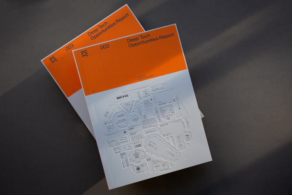
This year we’ve had a great—really wild—range of projects come through the studio. We continued working with a handful of partners in venture capital, from a complete rebrand for S2G Investments to a lovely ongoing series of books for our friends at DCVC, including their 2025 Deep Tech Opportunities Report. The report offers a look at the state of cross-sector innovation in the US and gave us an opportunity to create a really stunning tactile cover that nods to industrial manufacturing.
We did some killer work in the biotech, life sciences, energy, and innovation space. A new brand for Serif Biomedicines gave us an opportunity to craft a typographic identity that leans into parallels between the manipulation of letterforms and the intentional creation of genetic medicines.
And we developed a new brand strategy, identity, and website for Radical AI—a firm at the cutting edge of AI-driven material innovation—set to officially roll out this quarter.
The team also did some lovely work in consumer packaged goods. A new brand for a chocolatier (which will, unfortunately, never see the light of day due to factors beyond our control) gave us a chance to explore calligraphy and letterforms drawn from chocolate itself. Always good to keep experimentation and play flowing! And our brand for our friends at Portal Drinks hit store shelves throughout Chicago.
And then of course there is the project we did for Watermelon Pictures—more on that below!
The studio turned 20 in 2025—one heck of a milestone (and one heck of a project) in its own right— with a celebration that brought over 200 folks to our studio space in River North. Moving into the coming year, we’re expanding access to our studio space to welcome others in Chicago into the building. Two Thirty—the brand for the entire building—will function as something of a hub for the creative community through event space, co-working opportunities, access to tools, resources, and production equipment, and more. All in favor of bringing people together for more face-to-face interaction at a time when we believe we need actual human engagement more than ever before.
What are some of the projects you’ve worked on personally since your PRINT Awards win that you’re proudest of?
I spent significant time collaborating with my father—80, a graphic and industrial designer—and my daughter, 10. Familiar Gestures was an opportunity to collaborate through the reinterpretation of type, documenting marks made by each of their hands.
Binding Generations was an opportunity for my daughter to explore books from my father’s library that meant a great deal to him as he grew into a career as a professional designer. I found this work deeply meaningful as a way to bridge gaps and create shared understanding between the three of us in the context of something we all love.
Project Spotlight: Watermelon Pictures
As Sieren alluded to above, one of One Design’s most recent projects of note was the brand system they developed in collaboration with Field of Practice for Watermelon Pictures. Watermelon Pictures is a film production and distribution company rooted in creative resistance, that uses the power of film to amplify underrepresented voices, particularly those from Palestine and other marginalized communities. In need of a brand identity that communicated that, Sieren and his team at One Design worked with the strategic design studio Field of Practice for the endeavor. The One Design and Field of Practice teams elaborate on the project below.
I’d love to hear more about the bilingual identity system you recently developed with Field of Practice for Watermelon Pictures. What was it like working on a project with such a critical global impact?
Watermelon Pictures came to us as a family-owned startup—born from MPI Media Group, a company with deep roots in cinema—with a mission to champion unheard and underrepresented voices in the medium of film.
As a studio, we believe in the essential need for a diverse range of artistic voices and perspectives to be elevated and amplified. Conversation, understanding, and empathy require a platform where different perspectives have a chance to be heard. So on one hand, it was an honor to support a company driven by this mission. And it was an honor to be trusted with a seat at the table to help craft the beginnings of a mission-driven arts organization already brimming with global talent from the world of filmmaking, all driving toward this admirable goal.
It was also an opportunity to break standard practice and work in a new way. We invited Field of Practice—dear friends of ours from the Chicago creative community—to join the collaboration, bringing a unique perspective to the table that we wouldn’t have been able to bring on our own.
The project became a microcosm of the broader goal of Watermelon Pictures: creating a space to learn from one another in order to build greater understanding and appreciation.
The project became a microcosm of the broader goal of Watermelon Pictures: creating a space to learn from one another in order to build greater understanding and appreciation. Just as Watermelon Pictures seeks to build understanding through its medium, we expanded our practices—individually and as a studio—by building new perspectives, working with one another, and learning how each group approaches the work we do. This allowed us to see and understand perspectives, approaches, and creative and strategic insights we wouldn’t have had access to if we had worked in our typical ways.
At the end of the project, we witnessed a family-owned studio red-carpet-ready for its premiere at the star-studded Palestinian Film Festival in Chicago. Watching how the company has grown since—how it’s been received in the world of film, and how its lineup of content has expanded—has been an absolute dream.
What was the brief Watermelon Pictures came to you with, and how did you meet that?
Watermelon Pictures is dedicated to bringing powerful, necessary stories to global audiences. Under that banner, they came to us to create a cohesive brand and messaging that could both engage and connect with audiences in a way that fostered conversation, not contention.
We delivered both messaging and a robust visual expression that allowed them to enter the market and engage in dialogue in a mature yet inviting way.
Our commitment was to translate their mission into a cohesive, consistent identity system that could move confidently and fluidly across mediums—from on-screen, to posters, title cards, global festival circuits, and most recently Watermelon+ (a streaming platform that will serve as a home for its upcoming releases as well as several decades’ worth of Palestinian cinema)—while remaining unapologetically anchored in the founders’ Palestinian roots. It also needed to be scalable and flexible enough for independent filmmakers, yet credible and cinematic at an institutional level.
We met that challenge by focusing on clarity and resonant symbolism.
The visual language pays homage to historical symbols while expressing the company’s promise to preserve and elevate Palestinian cultural identity through film.
The system is rich with meaningful symbols and gestures—from travel stamps and watermelon seeds to Arabic messaging and graphic devices that offer a fresh lens on Palestinian stories.
The wordmark integrates both Arabic and English scripts, establishing linguistic and cultural parity. The wedge logomark subtly references cinema seating, while the seeds nod to our individual roles in collective storytelling, with each viewer carrying these narratives forward into the world. Surrounding all of this is an intentionally restrained system, designed to let the films themselves remain at the center.
What were some of the biggest challenges you faced in working on a bilingual identity system, in particular? What unique considerations have to go into a brand system that’s in two languages?
One of the challenges in developing a bilingual identity system is ensuring that we’re not simply matching two scripts visually, but creating a system where both languages carry equal weight and dignity. The brand needed to resonate deeply with a bilingual community across the Arab and Arab-American diasporas. This meant designing a system where Arabic was not treated as an afterthought or a direct translation of the English wordmark, but as an equal carrier of meaning and narrative.
This meant designing a system where Arabic was not treated as an afterthought or a direct translation of the English wordmark, but as an equal carrier of meaning and narrative.
Rather than create a single Arabic adaptation of the English wordmark, we developed a suite of variable Arabic marks, each inspired by lived experiences expressed through stamps, travel documents, and paper trails accumulated while crossing borders. This decision anchored the system in a visual vernacular that feels authentic to the spirit of Watermelon Pictures. It also offered the brand a flexible typographic toolkit that could express various voices with consistency and cohesion.
Choosing Za’atar as the primary Arabic typeface was equally intentional. Za’atar holds a bold sharpness that echoes the tone of the English wordmark type: Farmacia. Its structure allowed us to honor cultural memory while still presenting a contemporary, cinematic voice. In practice, it created a bilingual system where Arabic does not act as a translation layered on top of English, but as a primary storytelling mark in its own right.
To complement Za’atar, we introduced Ada Ruqaa as a secondary typeface for moments that needed tonal contrast. Ada Ruqaa brings a refined, contemporary take on the traditionally quick-hand Ruqaa script, adding a calligraphic flavor that can signal urgency or documentary voice.
What aspect of this project are you proudest of?
It was an honor to support a project and a brand with such a clear goal: to highlight, elevate, and disseminate the work and voices of culturally underrepresented filmmakers and artists. In a climate where the dominant view is often shaped by Western cultures and perspectives, it’s critical to hear from all cultures and viewpoints— to recognize the commonalities we share and to appreciate the value our different experiences bring to our collective existence.
It’s astounding to see how the Watermelon Pictures community has seen themselves reflected in the brand and embraced it so fully. It stands boldly and with great integrity alongside major cinematic voices, while staying rooted in its lineage and holding the emotional charge of its context with profound dignity and care.
We’re also proud of the collaboration itself. One Design and Field of Practice truly worked as one studio. We conducted interviews with filmmakers, film lovers, and even the founders’ father, and learned about the brilliance of Watermelon’s creative team, helmed by Alana Hadid. We shared insights, sketched across languages, and stayed attuned to the gravity of the work. The resulting system is a seed for storytelling, resilience, and cultural memory— and we’re deeply proud to have played a role in shaping it.
Feeling inspired? Apply to the 2026 Print Awards now!
The post Revisiting Past PRINT Awards Winner, One Design appeared first on PRINT Magazine.