Rebuilding a brand that has been in existence since 1977 is no small feat. Superfeet has carved its reputation in the performance insole category with a formula grounded in biomechanics and comfort. For the most-used, often abused part of our bodies, our feet, Superfeet believes that innovation is vital. So, this year the brand rewrote its own playbook. In partnership with New York-based design studio MLTI, Superfeet has launched a sweeping rebrand that doesn’t just update the logo, but rethinks what it means to support today’s athletes and non-athletes alike.
Unveiled in New York City in May, Superfeet arrived with a bold new strategy and visual language, showcased alongside product innovation and an appearance from former Olympian Sanya Richards-Ross (and former housewife of Atlanta, iykyk). But more than a moment, this was a declaration: Superfeet is moving forward with speed, clarity, and a whole new kind of energy.
Inspired by the [Superfeet’s] own testing labs, the new identity leans into a vernacular of performance, gridlines, x-ray overlays, dot matrices, and typographic notes that feel pulled straight from a biomechanical report.
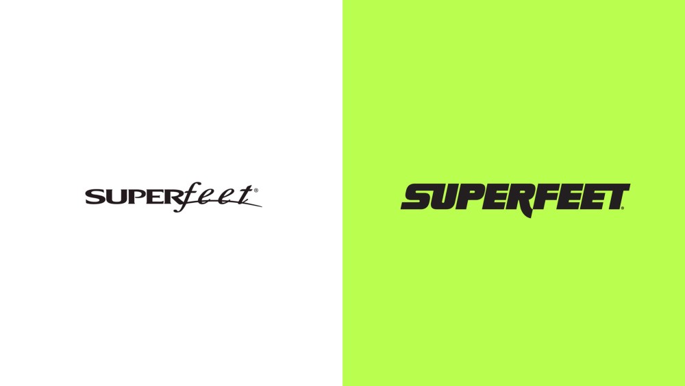
MLTI, led by ex-Nike designer Kristen Shenk, developed the visual system. Inspired by the brand’s own testing labs, the new identity leans into a vernacular of performance, gridlines, x-ray overlays, dot matrices, and typographic notes that feel pulled straight from a biomechanical report. The type system builds on this technical foundation: a bold, italic wordmark with unexpected curves evokes speed and softness in equal measure, while mono fonts and labeling motifs reference lab-tested credibility.
Central to the rebrand is the line “Powered by Superfeet”—less a slogan, more a connective thread running through every touchpoint. The phrase elevates insoles from utility to unseen advantage, a recurring theme in the campaign’s imagery. In one signature visual treatment, x-ray-style CGI reveals the product inside the shoe, transforming an invisible insert into a visual hook.
We made the unseen seen. It’s about revealing the hidden tech that gives you the edge.
Kristen Shenk, MLTI founder and creative director
The color palette introduces “Super Green,” a vivid neon hue lifted from the brand’s best-selling product, now turned brand signature. Paired with black, white, and soft neutrals, the palette balances tech-forward energy with modern restraint and approachability.
Inclusive storytelling also embraces a broader definition of athleticism. While Superfeet’s heritage is in sport, today’s campaign features a range of movement-driven lives: marathoners, warehouse workers, nurses. A cinematic brand film, “Powered by Superfeet,” punctuates this shift with poetic narration and pulsing visuals. It’s a tribute to what happens on your feet—from “training days” and “two-a-days” to “chasing your best self.”
“Superfeet has always supported those who move,” says Trip Randall, the company’s CEO. “This is about speaking to that movement—wherever it happens, however it looks—with purpose and power.”
The refresh is strategic, but it’s also deeply emotional. It asks what it means to be powered by something you can’t see, but feel with every step. It’s about reclaiming performance not just as a metric, but as a mindset.
For Superfeet, this marks more than a design evolution, it’s a full reorientation. “Together, we built a system that flexes with people’s lives,” says Shenk. “This brand had purpose and product. We just helped bring the energy forward.”
The post Superfeet’s New Brand Identity Reclaims Performance as a Metric and a Mindset appeared first on PRINT Magazine.