PRINT Awards Professional Honorees in Advertising, Annual Reports, Brochures & Catalogs, Books – Covers & Jackets, Books – Entire Package, and Editorial
The winning work in these categories created memorable visual moments to connect with readers, customers, and communities. Jury members included Mike Nicholls, Taylor Le, and Miller McCormick in Advertising and Editorial, and Alex Lin, Dora Drimalas, and Pablo Delcan, who reviewed entries in Annual Reports, Books-Covers, Jackets, Books-Entire Package, and Brochures & Catalogs.
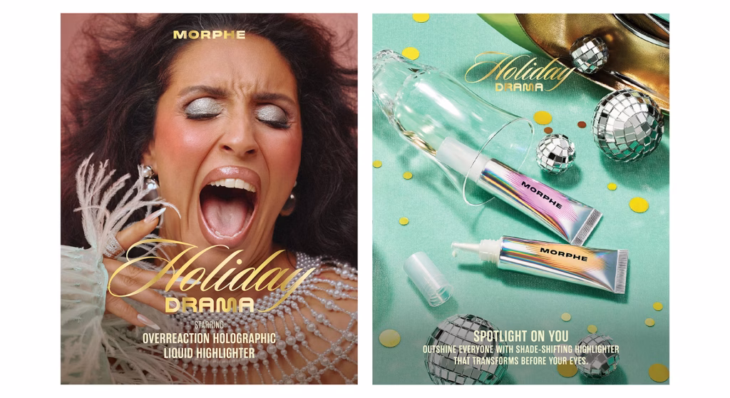
Professional Advertising
First Place – Morphe “Holiday Drama”
Design Army – Pum Lefebure
To generate excitement around Morphe’s holiday capsule collection, the team developed a bold, tongue-in-cheek campaign celebrating seasonal glam at its most dramatic. Designed for beauty lovers who thrive on bold expression, the concept invites audiences to embrace the chaos with confidence. Inspired by vintage TV soap operas, a series of short film clips brought the collection to life with playful nods to messy holiday moments, where flawless makeup always steals the scene.
Packaging took cues from retro VHS tapes and glitchy box sets, reimagined through a custom holographic pattern blending Morphe’s “M” with the collection’s vivid hues. Every detail—from eye-popping visuals to witty product names like “Shade Thrower,” “Party Crasher,” and “Crowd Pleaser”—was crafted to amplify the fun, over-the-top spirit of the season.
Second Place – Morphe “Forbidden”
Design Army – Pum Lefebure
Created for a Chinese New Year release, Morphe’s “Forbidden Collection” campaign blends bold beauty with serpent-inspired symbolism. Reimagining the Garden of Eden, the concept tempts makeup lovers with dark, seductive eye and lip products, positioning makeup itself as the ultimate forbidden fruit. Real-world visuals and AI merge in a lush, fantastical paradise, where the boldest look is revealed when one embraces their inner nature.
Art direction features real props, models, and Morphe products, enhanced by AI and inspired by global landscapes—from the Himalayas to Chinese rivers and Icelandic moss. Custom thorned typography, actual fruit, and painterly textures bring the vivid, surreal world to life, perfectly capturing the collection’s rich, ethereal palette.
Third Place – AARP Movies for Grownups Takeover Ad Campaign
AARP – Matt Hulbny
AARP’s Movies for Grownups initiative champions the 50-plus audience in the entertainment industry, advocating for age-inclusive storytelling and fighting ageism. By promoting films that resonate with older viewers, the program pushes for a more representative and age-friendly cinematic landscape.
As part of this effort, the Movies for Grownups website takeover ad campaign was launched to spotlight current award winners during the peak of awards season. By securing ad space on a prominent industry platform, AARP increases visibility for these films, boosting their recognition while celebrating the preferences and stories that matter to older audiences.
Professional Annual Reports
First Place – The Nuture is Nuclear, Bruce Power Annual Report
Bruce Power – Erin Grandmaison
Bruce Power’s annual report, The Future is Nuclear, is a bold, tactile piece that reflects the company’s commitment to innovation, strength, and transformation. With a sleek black cover enhanced by UV ink and a die-cut circle revealing a silver-foiled title, the design creates a sensory experience that symbolizes energy and precision. The circle becomes a metaphorical nucleus, representing Bruce Power’s core values of connectivity and innovation.
Inside, a vibrant palette and atom-inspired icons guide readers through key themes like safety, clean energy, and isotope innovation. Silver foil accents highlight major achievements, while photography of employees and communities brings a human touch to the technical story. Complemented by a dedicated website and accessible PDF, the report offers a seamless and impactful experience.
Second Place – Ysleta del Sur Pueblo, 2023 Year-End Report
Anne M. Giangiulio Design – Anne M. Giangiulio
This year-end report for the Ysleta del Sur Pueblo (YDSP), a Puebloan Native American tribe in El Paso, Texas, honors the legacy of Quarai Pueblo—an ancestral site in New Mexico where YDSP’s forebears lived for centuries. In May 2023, tribal leaders, members, and employees visited Quarai to pay tribute to their ancestors. The report’s design, featuring precise die cuts by Tovar Printing, reveals the title and architectural silhouettes of Quarai against the New Mexico sky, symbolizing a deep connection to heritage. Photographer Christ Chavez captured the red sandstone masonry and spirit of the people who built Quarai with extraordinary skill and resilience.
The design draws a powerful link between past and present, reflecting the enduring industriousness of the Pueblo people. This connection is embodied in the July 2023 opening of YDSP’s new 78,000-square-foot health clinic—a modern symbol of tribal wellness, strength, and perseverance. The report not only honors ancestral achievements but also celebrates the living legacy of the Ysleta del Sur Pueblo today.
Third Place – Hall Family Foundation Annual Report, 2023
MBB – Rob Mitchell
The Hall Family Foundation approached MBB with a meaningful opportunity: to design its annual report highlighting the impact of its partners throughout the Kansas City community. During the initial discovery phase, MBB identified a broader opportunity to use the report as a platform to unify the Foundation’s visual and verbal identity moving forward.
To achieve this, MBB introduced a modern and vibrant design system that reflects the uplifting nature of the Foundation’s work. Typography and storytelling played a central role, supported by a flexible grid system that provided both structure and creative fluidity. This design approach emphasized white space to spotlight powerful stories and photography, bringing the impact of the Foundation’s work to life.
Professional Books – Covers & Jackets
First Place – The Blueprint
Harper Books – Robin Biardello
In the vein of Octavia E. Butler and Margaret Atwood, a harrowing novel set in an alternate United States—a world of injustice and bondage in which a young Black woman becomes the concubine of a powerful white government official and must face the dangerous consequences.
“The Blueprint is an astounding work, an unflinching portrait of misogyny and racism in a speculative world terrifyingly close to our own. Rae Giana Rashad chronicles the generational ghosts of womanhood, and how we understand ourselves through the stories of those we come from, in a way I’ve never read before. A remarkable new talent, and a timeless literary voice.”
—Ashley Audrain, New York Times bestselling author of The Push
Second Place – The Ministry of Time
Avid Reader Press/Simon & Schuster – Alison Forner
The design challenge was to create a bold, fun, and original look for a book that spans multiple genres. To achieve this, designer Andrew Footit, known for his distinctive typography, was brought on board. His style perfectly aligned with the vision of blending old and new, a visual reference to the book’s time-travel theme. The use of 3D Victorian-style type set against a starry background created a striking and unexpected contrast, effectively capturing the story’s spirit.
The result was a book jacket that resonated strongly with both readers and the design community. Its unique visual approach helped the book stand out in a crowded market and contributed to its significant commercial success.
Third Place – The Regenerative Almanac, Matriarchal Futures
One Design Company – Will Moran
The Regenerative Almanac embodies the vision of Matriarchal Design Futures, imagining a world 100 years ahead where knowledge is abundant, inclusive, and free from scarcity or competition. Designed as a living, bioregional guide, it integrates traditional ecological knowledge, regenerative design, and cooperative governance to keep education, technology, and care work interconnected. More than a book, it serves as a seasonal tracker and communal tool that evolves with the land and its people, fostering intergenerational stewardship and collective wisdom.
This work was created as part of the Matriarchal Design Futures: Bookstand 2125 project, a collaborative design fiction initiative inviting artists and designers to imagine books from the year 2125. The project envisions futures where creativity and knowledge thrive within systems centered on care, nurturing, and collective well-being rather than competition. Contributors were encouraged to explore bold and challenging ideas to inspire preferred futures. The project was created and curated by Ayako Takase (RISD) and Heather Snyder Quinn (DePaul).
Professional Books – Entire Package
First Place – The Interpretative Power of Memories
Royal College of Art – Yunqi Peng
The Interpretive Power of Memories is a research project focused on audience interaction within independent publishing practices, particularly exploring the diverse and evolving roles in China’s art publishing scene. The project challenges traditional storytelling by allowing stories to represent multiple images and images to evoke different memories, shifting interpretive power back to the audience for a unique, intimate reading experience.
The project includes a collection of everyday forms and documents typical of a Chinese person born in the 1990s, such as school communications and epidemic temperature records. Unlike traditional books that convey a single message, this work invites varied interpretations, fostering connections among viewers and creating an imagined, temporary community. The images, presented entirely in Chinese, highlight language as a barrier while emphasizing the universal nature of visual communication. To engage audiences further, bilingual diary notes are provided for readers to match with images and share their interpretations.
Second Place – This Page is an Occupied Territory
EarSay – Warren Lehrer
Poet and cultural critic Adeena Karasick collaborated on a project featuring her poem This Page is an Occupied Territory, written in response to the war in Gaza and Israel. The poem inspired a unique tabloid-sized, newspaper-like publication designed to reflect the overwhelming and expansive nature of conflict. The design incorporates letterpress printing techniques with wood-type characters and borders, creating a typographic landscape that evolves from open to increasingly fragmented and boxed-in text. The publication is self-referential, drawing parallels between territorial occupation and linguistic translation, exploring the occupation of language itself as much as physical territories.
The work serves both as a reading score and a performance piece, with Karasick’s dynamic live readings often accompanied by animated projections of the pages. Influenced by the anti-Nazi Dutch typographer H.N. Werkman, whose improvisatory style informed the visual motifs, the project honors the power of design and literature to confront war and injustice. Published shortly after its creation, the edition of 700 copies was distributed both for sale and free, continuing a tradition of art as resistance and social commentary.
Third Place – The Complete Commercial Artist: Making Modern Design in Japan, 1928–1930
Letterform Archive – Alice Chau
The Complete Commercial Artist, a twenty-four–volume compendium released between 1928 and 1930, is the most important—and most visually dazzling—early document of modernist Japanese design. In this book, art historian Gennifer Weisenfeld takes readers inside this remarkable design artifact, contextualizing hundreds of full-color reproductions spanning every volume, with an extensive historical introduction and volume-by-volume walk-throughs.
Designed by Alice Chau, the volume features a foil-stamped jacket with a vellum belly band wrapped around a paperback book sized to match the original. The cover and jacket designs also faithfully preserve the look of the compendium volumes. Inside, the book’s running sides take inspiration from the spines of the original paperbacks. Bright section openers and table of contents riff on the original’s endpapers, while elegant type choices and thoughtfully incorporated Japanese text make this book an attractive present-day window into a formative moment in design history.
Professional Brochures & Catalogs
First Place – Fall Gala, “Feast for the Soul”
Selman – Johnny Selman
The Cathedral Church of St. John the Divine’s fall fundraiser, “Feast for the Soul,” offered guests an elegant evening filled with art, music, dance, and poetry, featuring rare artworks brought out of storage for the first time in a decade. A highlight of the event was the use of the cathedral’s iconic bronze doors as the main entrance, a rare occasion since they are typically closed to the public.
To commemorate this special event, the design studio created a gatefold brochure inspired by the bronze doors. The front cover featured metallic ink on deep black cardstock to showcase the intricate panel details, unfolding from the center to symbolize entering through the historic entrance. Inside, a metallic schematic of the cathedral’s floor plan guided guests to art displays and timed performances, complemented by a note from the dean, a detailed program, and essential event information. Designed as an elegant and functional keepsake, the brochure balanced sophistication with clarity, celebrating the evening while honoring the cathedral’s architectural heritage.
Second Place – 2024 Holiday Book, Neiman Marcus
Neiman Marcus – Jessica Oviedo
A Neiman’s Fantasy, Neiman Marcus’s 2024 Holiday Book, reimagines tradition with bold artistry and a blend of art nouveau and modern design. Featuring custom line art, dynamic frames, and a rich color palette mixing classic and contemporary tones, it creates a timeless yet fresh holiday narrative.
The cover’s keyhole motif invites readers into a magical holiday world, with photography and design revealing whimsical scenes framed like glimpses through keyholes. Elegant serif fonts and custom lettering add to the book’s enchanting atmosphere. By merging classic motifs with modern style, A Neiman’s Fantasy elevates the holiday shopping guide into a captivating work of art.
Professional Editorial
First Place – HUE: The Magazine of FIT, the Fashion Institute of Technology, Summer 2024
Alexander Isley Inc. Designers – Alexander Isley
This special digest-sized issue features sketchbook artwork from designers, artists, teachers, students, writers, businesspeople … all representing the breadth of the FIT experience. This innovative exploration addresses the question “Where do ideas start?”
The creative team has designed the magazine for the past three years, working with the editorial team in commissioning FIT alumni to create the photography and illustrations. The 48-page issue is a compact 6″ x 9″ size, and includes gatefold inserts for enhanced tactility and visual storytelling. This richly layered publication showcases talent and poses a thoughtful meditation on the origins of creativity.
Second Place – Shadow Fleet
Owen Gildersleeve was commissioned to create the cover illustration for both the print and digital editions of Politico Europe, accompanying a feature article on “Putin’s sanctions-busting shadow fleet” and its environmental impact. Drawing inspiration from vintage Russian propaganda posters, Owen employed bold graphic forms and a limited color palette to craft a three-part illustration depicting oil tankers from dramatic angles, with slicks of oil trailing behind them.
The illustrations were initially designed in Adobe Illustrator and then carefully translated into handcrafted, multi-layered paper artwork, using foamboard to create depth. Photographed in Owen’s Brighton studio under natural light to highlight the paper textures and soft shadows, the images were finally retouched in Photoshop before being delivered for use on the magazine cover and Politico’s homepage.
Third Place – Dialogues Magazine
Atlantic Re:think – Drew Campbell
The online landscape is saturated with AI discourse, often characterized by uncritical optimism or dystopian fear. With that in mind, the design team jumped at the chance to cut through the noise. In partnership with Google, they produced a one-of-a-kind publication that spotlights diverse perspectives on the topic in a unique and nuanced way. The result of this collaborative effort, titled Dialogues, is a magazine that combines thoughtful storytelling with bespoke visuals to frame fundamental questions about the ethics, potential, and future of AI.
More information about the creators, projects, and additional design credits can be found on the PRINT Awards Gallery.
Next up: Professional Honorees in Branding Campaigns, Branding Collaborations, Branding Identities & Identity Packages, Packaging, Logo Design.
The post The 2025 PRINT Awards Honorees in Advertising & Editorial Cut Through the Noise appeared first on PRINT Magazine.