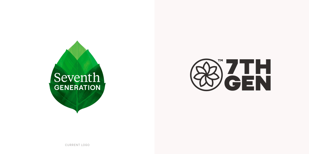
Sustainability brands have long been defined by soft color palettes, delicate leaf motifs, and messaging that nudges consumers toward “doing less harm.” It’s a visual and verbal language that feels familiar and comforting — maybe even expected. So when VSA Partners proposed a fresh take in their hypothetical rebranding of Seventh Generation, asking “What if sustainable cleaning felt like the strongest choice, not just the kindest?” it’s hard not to sit up and take notice.
This project is a creation of Design4Better, VSA’s innovation playground, where leading designers reimagine iconic brands; not driven by clients or pitches, but by pure passion for design. Free from briefs and business constraints, it’s all about instinct, craftsmanship, and the boundless possibilities that emerge when creativity has no limits.
The hypothetical Seventh Generation rebrand project offers a bold, assertive identity that pushes away from the gentle earth tones and into a world of commanding visuals and streamlined messaging, promising efficacy. It’s an ambitious move, one that certainly breaks from the eco-branding mold. And yet, while the effort to rethink sustainable branding beyond softness is commendable, the result ultimately feels like a leap toward minimalism for minimalism’s sake.
Bold minimalism strips design down to its essentials, using strong shapes, clean lines, and striking contrasts to create a powerful, confident presence. It gained traction in the 2010s, driven by the need to capture fleeting attention in our fast-paced digital world. It’s a trend that favors clarity and impact, but risks feeling impersonal if it sacrifices warmth and storytelling.
The Seventh Generation revamp could just as easily belong to a high-end cosmetic line as a cleaning product. In doing so, it risks erasing the very essence that makes Seventh Generation recognizable, its approachable, trustworthy, and nature-rooted personality. By chasing a design trend that favors starkness over storytelling, the redesign seems to gloss over the strategic foundations that have long anchored the brand.
Nested among other products that utilize bold minimalism, the hypothetical rebrand doesn’t stand out.
Sustainability branding doesn’t have to be synonymous with the predictable palette of greens and pastels — yes, that’s been overdone. But these visual cues also carry meaning and familiarity that consumers trust. There’s comfort in those leafy icons and gentle tones because they subtly communicate care, respect, and connection to nature. The challenge lies in evolving those cues, not abandoning them wholesale.
The hypothetical rebrand’s sleek, stripped-down style, though visually strong, risks fading into the background of countless other products—cosmetics, tech, and beyond—that share the same bold minimalism. Instead of carving out its own space, it blends in, making it harder to tell that this is a sustainable cleaning brand at all.
What feels missing in this rebrand is a nuanced strategy that balances boldness with authenticity. There’s a difference between standing out and standing apart. Seventh Generation’s visual identity certainly needs a brand refresh, but it must also hold onto the elements that have cultivated consumer loyalty and clearly signal its category on crowded shelves.
The following is Seventh Generation’s plastic-free line, which feels like a more authentic step toward modernizing the brand’s aesthetic and offers an opportunity to incorporate bolder colors and updated visuals.
This project is an interesting experiment, and I applaud VSA Partners’ Design4Better to explore the edges of what sustainable branding might become when freed from briefs and business goals. Yet, it also serves as a reminder that innovation in branding is most powerful when it’s rooted in the brand’s unique story and strategic intent, not simply aesthetic shifts chasing the latest trend to stand out for the sake of it.
Sustainability is more than a look; it’s a promise and a lived value. Design should echo that, blending craft and purpose to create a lasting connection. For a Seventh Generation rebrand, the strongest choice might be to evolve, not erase.
Header image created by the author using Freepik and edited with Photoshop.
The post The Collision of Bold Modernism and Eco Branding: VSA’s Seventh Generation Experiment appeared first on PRINT Magazine.