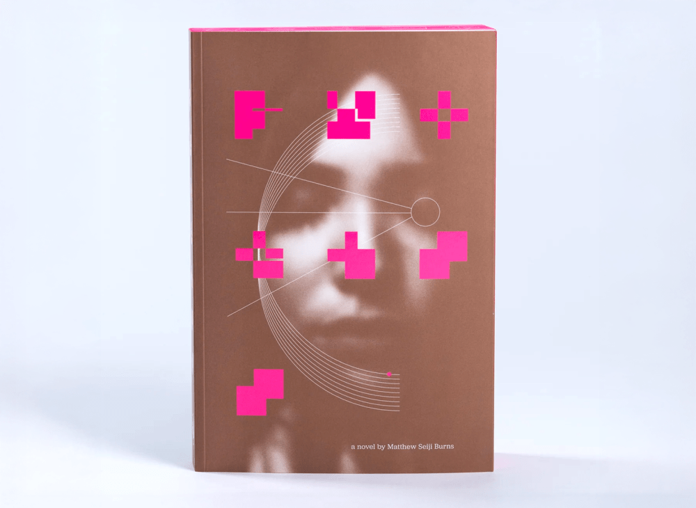
The other day I found two copies of an enigma sitting on my chair. Who left them was a mystery. It was a book, yet the block markings printed on the cover in fluorescent pink against brown—which I assumed composed the title—required deciphering. Thankfully, the title spread provided more information: Process, a Novel by Matthew Seiji Burns, illustrations by Manfredi Caracciolo, photo illustrations by Mark Wynne. (Office Services had apparently left them, figuring they were meant for me.)
But that was only the beginning. I started reading what was a traditional linear narrative composed and illustrated in an unconventional way, which became more and more anarchic in parts, and calming in others. It was not the easiest reading experience, but after navigating a number of pages I found the groove and went with the flow. Every page was an adventure, like climbing a mountain (which is not my forte) or playing a video game (which is not my favorite pastime), where every turn of the page posed a new challenge or surprise respite. I reckon every typographic permutation was employed: I had to climb over shards and skewed columns of type to reach plateaus of straight text and islands of meaning, all the while being hit with visual illustrative and typographic distractions. Process was not designed for relaxation but rather to test the tolerance of the reader. A novel has to be extraordinarily well done to survive this obstacle course. This is that.
I was so intrigued by the audacity of the Dublin-based publisher, Tune & Fairweather, the courage of the author and the tenacity of the designer that I contacted Wynne to tell me more about the process of creating Process.
Was this a tough sell to get published?
Jason Killingsworth and I had worked together 15 years ago on the cult video game magazine EDGE. I’d watched him launch Tune & Fairweather in 2019, and admired the ambition and passion of his highly idiosyncratic, beautifully crafted books. He’d gradually broadened his subject matter from exploring the lore and artistry of video games to art, photography and literature, and I was enthusiastic about working with such a respected publisher. He shared the manuscript of Matthew Seiji Brown’s novel with me and I offered to pitch him a design treatment.
Tell me more about the genesis of Process.
Jason had previously published Pulitzer-nominated author Charles McNair’s The Epicureans as a beautifully illustrated novel, but he wanted to go further with Process. He’d already commissioned artist Manfredi Caracciolo to provide a dozen or so illustrations for the book, but he was intrigued by the idea of breaking down the binary relationship between illustration and text to make a more organic reading experience. Jason had seen my visual poetry and knew we shared the same love for experimental type, so I made a mood book of my visual inspiration, including the British concrete poets Dom Sylvester Houédard, Bob Cobbing and Keith Armstrong; artists like Duchamp, Francis Bacon and Warhol; and important editorial designers that I’d followed my whole career in magazines, including Neville Brody, Jonathan Barnbrook, Stefan Sagmeister, Tony Brook, Jim Sutherland and Scott Dadich, whose “Wrong Theory” written whilst at Wired was especially resonant. The analog collages of Katrien de Blauwer were also important mood pieces for me.
Mark Z. Danielewski’s extraordinary House of Leaves—which Jason turned me onto—was a key influence as well, of course, although from the start, I knew that I wanted to add manipulated stock photography to the mix. I’ve always been fascinated with Marshall McLuhan’s 1967 book, The Medium is the Massage, which challenged the interplay between text and image, and that’s what I’ve spent my career in editorial design exploring. House of Leaves is kind of unassailable (yet very easy to badly fake), so I knew we had to stake fresh ground.
Jason liked the mood book so I made a series of sample treatments to demonstrate how we might engage with Matthew’s novel in a much more intense, involved way. The narrator’s frequent flights of fancy and scientific digressions offered wonderful opportunities for visual interruptions, which we were both excited by. We agreed on some fundamental principles, techniques and a (very loose) timescale.
What is the plot of the novel?
The story is set in the dark heart of Seattle’s tech startup world. The main character, Lucas Adderson, is a young man driven by an almost animalistic need to find outsized success creating the next unicorn tech company. His days are riddled with surreal meetings and strange characters, anxiety and self-torture. Sexual obsession, pseudo-religious mania and identity crisis fuel a wonderfully unreliable narrator.
Was this book conceived with experimental typography as the first impulse?
The book wasn’t written with an experimental visual treatment in mind, but Matthew was enthusiastic about our approach and offered feedback and advice throughout the process. I was conscious that this radical degree of reinterpretation by me could be problematic—my reading of the book would inevitably be subjective—but when Matthew and I first spoke we noted our shared admiration of Dante’s The Inferno and parallels between Lucas and Dante’s Pilgrim, which reassured me that empathetically we were on the same page.
You are credited with design and photo illustrations. Manfredi Caracciolo created the “Brutalist” illustrations. What differentiates these tasks? Did you two consult during the production?
Jason had commissioned the illustrations before I was involved. Manfredi’s art was symbolic and meditative—wide-angle views of Lucas’s journey that contrasted with the more aggressive typography and collage I was planning—so I divided them evenly throughout the book to provide familiar stepping stones, grace notes of contemplation. The harsh angles and striking geometry of his work were echoed in the form and shape of the typographic design, the illustrations occasionally interrupting or being interrupted by text, and mirrored by scattered fractals.
Is there a symbiosis between the two forms of illustration and the typography?
Lucas’ inability to meaningfully connect with his colleagues or family inspired the introduction of generic stock photos to represent each character. We wanted to suggest individual characters but treat them with the blur and mis-registering of depression-induced depersonalization. Sometimes characters’ names are blown up so that they are seen as graphics rather than type, their psychological significance felt by the reader rather than understood.
The decision to keep the book monochromatic—with accents of fluoro pink and metallic copper—came from wanting to match the Gustave Doré–like atmosphere of Manfredi’s illustrations, and also to help unify the many disparate photos we were collaging.
On a basic level, characters and locations related to the story would appear as visual clues, treated in a style appropriate to the narrative. So Lucas’s muse—Megan—existed as just a handful of similar generic stock images but is alternately cropped, blurred or disrupted according to Lucas’s reaction to her. Photos of his father—again, stock images, heavily edited—are often super-sized but “cancelled” with blank shapes or overlaid with diagrams of a fighter jet that Lucas remembers him designing to signify the idiosyncrasies of memory and difficulties of their relationship. A female co-worker with whom Lucas has shallow sexual relations is represented by provocative, fetishized photos that reflect his narrow perception of her.
There’s a quote from the artist Tom Phillips—talking about his first attempts at, coincidentally, a Dante painting—where he says, “The picture seems to risk every kind of absurdity in its effort to weld together things incongruous of form and scale and style. …” Defining and maintaining a coherent visual logic with so many disparate elements was definitely the most challenging part of the process.
Some of the typographic work feels to me a bit arbitrary. What is your feeling about this?
The book’s provocative typographic approach mirrors the protagonist’s psychological disintegration: We wanted the reader to be initially disorientated. The sense of Lucas’ mind unraveling invited a kind of visual unraveling, and this method-acting by myself as designer almost pretending to be Lucas became the creative engine that propelled the design. So just as Lucas’ narrative frequently oscillates in mood, tone and focus, so too the typography would break with columns, scale and form. There are some internal laws underpinning the use of type, however, as well as obvious stylistic echoes in scale—sometimes he whispers, sometimes he shouts, sometimes his sentences veer into abstraction. Important asides or key phrases are often highlighted in special inks, images are sometimes used as words and vice versa. There are also some hidden messages and variations of text that observant readers may eventually discover within the layout.
A crucial ingredient was our signature font, TwoBlock by Paul McNeil and Hamish Muir. The blocky, early-digital aesthetic corresponded with Lucas’ obsession with code, but its wide range of weights and deconstruction into vertical-only or horizontal-only variants enabled us to hint at Lucas’ difficulty with communication. It also just looks beautiful at any scale and has great emotional power whether legible or not. I only remembered when the book came back from the printer that we used TwoBlock as full-page chapter numbers in a weight that was frequently unreadable, but this act of playful antagonism toward the reader cut to the heart of what we wanted to do. By making the text somewhat difficult to engage with, the reader could enjoy a kind of puzzle-solving agency and get pulled deeper into the proceedings.
Did you have many iterations before deciding on your final direction?
Chance and improvisation were crucial techniques that I employed, partly to maintain a creative intensity to a huge logistical undertaking, and partly to adhere to my principle of roleplaying as narrator. So, for example, the photograph on Page 45 of Lucas waking down a street was imported into the InDesign document upside down by mistake, but this fluke actually brought a whole new psychological dimension to the image: Lucas was not just walking towards another office meeting he dreaded, he now seemed to be walking down to hell. And an image on Page 55 of ants crawling out of the palm of Lucas’ hand—inspired by the Buñuel/Dalí film Un Chien Andalou—errored in the InDesign document, but the fractal corruption was more evocative than my original intention.
Embracing spontaneity made decision-making challenging, and inevitably there would be dozens of iterations of every page followed by retrospective shuffling as we’d try to identify pages that worked not just independently but as part of a chapter, and then again, as part of the whole book. I was also following a few fundamental principles of magazine editorial design—my first discipline—making sure there were entry points and dynamic composition on every spread.
I’d send chapters to Jason, who would offer advice on how to strengthen the work. I’d frequently veer down routes that were dead ends and needed to be pulled back, but Jason was also a champion for “more” and he’d encourage me to experiment and take risks. It was a richly collaborative experience, with both of us uniting to find an authentic visual tone for Matthew’s protagonist, a surreal and wonderful way of working.
Jason’s uncompromising commitment to excellence also raised the stakes for me as a designer. To be working on a project with so many special inks and treatments that was going to be manufactured by a world-class printer—L.E.G.O. in Vicenza, Italy—meant that nothing was going to stand in the way of us making the most beautiful book we could.
How do you believe that Process stands out from other, say, Constructivist, Concrete, Dadaist, etc., book designs?
Jason and I both wanted to present Matthew’s novel in a unique, distinctive way that was true to his story but also unlike anything we had previously seen. A sense of exploring the unknown was as vital as our mutual love for experimental art and design.
Your book written with Gail Anderson on experimental typography, Type Tells Tales, highlights the crucial quandary at the heart of Process. In the foreword you question the functional imperative of type to support the written word and ask, “Should a designer ever seek to upstage the well-written word?” Your answer is a qualified “yes” if the design is helping the reader to engage more fully with the words, and that’s what we felt that we were doing. We wanted to amplify the emotion of Matthew’s story and communicate it in a unique way. Just as hearing an audio transcript of a book provides a subtly different range of inflections and tones, we hoped this “version” of Process provides an interpretation that is both subjective and authentic.
On a personal level, over a 30+ year career in design, I’ve often questioned whether I have a signature style of my own. The ambition, of course, is to distill all your influences and inspirations into a coherent voice: easy to spot in others, but difficult to do with your own output. It strikes me as ironic that by role-playing as a fictional character, I may have actually found the truest and best expression of my own design identity.
The book requires some intense attention from the reader. Do you have a navigational plan?
There are a few major signifiers of what’s happening—such as the gatefold just over halfway through the book where Lucas has a breakdown/revelation—and as the book enters its climatic chapters, the “design magnets” holding the elements together lose their charge, as it were, and the book breaks down. My love of visual poetry provided a clear ambition: to make pages that delighted at first glance but also offered longer-lasting rewards. Books are a visual, cerebral and tactile experience. The richer and deeper, the better.
What do you hope the reader/viewer will take away from this volume?
Jason and I both share a passion for printed books, and a sense of awe at what can still be achieved. I think that we approached Process with the desire to make something we hadn’t seen before, hoping that whatever readers we found would come away with a deeper appreciation of Matthew’s fascinating, timely novel.
The post The Daily Heller: A Novel With a Typographic Plot appeared first on PRINT Magazine.