Ponder this: If digital font technology did not exist, would we creatures who walk the Earth need as many typefaces as we have today? Physically, there would be no way we could have produced such a large quantity of tactile type. And maybe that’s a good thing … or maybe not. Fonts are now produced at such a speed that in a dystopian future the government could issue a unique personal typeface for each citizen to serve as personal identification.
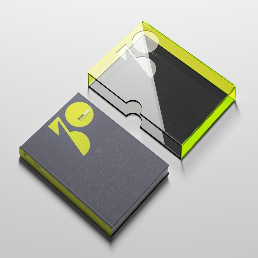
One thing is certain: If there were no digital typesetting, Rian Hughes of Device Fonts would have to do something else with his time. For the past 30 years he has been the proprietor and chief designer of over 300 faces that range in concept from the ridiculous to the sublime. He’s now issuing a 600-page book of catalog and specimen sheets, and for this milestone year he has compiled Typeractive: Device Fonts 1995–2025, which he’s funding via Kickstarter.
To celebrate Device’s anniversary, Hughes’ book is a slice of living history.
How have you found the time and energy to design this many typefaces?
Thirty years add up! A commissioned font for a client here, another just because inspiration hit there, and after three decades you end up with a library that covers a wide range of styles, from sans to serif to all manner of weird experimental designs that don’t fit into any sensible category. But, honestly, it’s a compulsion—and like all compulsions, I find it more difficult not to design fonts.
Why do you design typefaces? Put another way, where does the fascination with designing and redesigning this basic set of simple glyphs called the alphabet come from?
It’s an interesting philosophical question. Certainly, it’s not a matter of need. Today, we have an embarrassment of riches when it comes to digital fonts, and more are released on an almost daily basis. So, one might assume there was already one (or two, or three) fonts suitable for every eventuality.
Or that just one typeface, readable and utilitarian, inarguably perfect in every way, had been scientifically designed and agreed upon. This modernist project—of designing the ultimate functional font, one which would negate the need to ever design or use another—has in fact produced a profusion of contenders, and to choose between them, ironically, comes down to a matter of taste.
Font design is far too expressive to be so constrained. Where the alphabet itself, arranged into words and sentences, is a superlative carrier of meaning, the style of those letters adds an additional layer, a tone of voice, perhaps. Form, and content. A musical analogy might be the lyrics and the melody.
Designers have charted every popular movement in fashion and the arts with type that evokes, nay screams, the period of its birth from record and CD sleeves, book covers, posters, magazines and T-shirts. Type can be so precisely evocative. Consider the “bubble” Frankfurter lettering of the 1970s, the bouncy Latin serifs of the 1950s, the bellbottomed psychedelic fonts of the 1960s and the ransom note cut-and-paste of the punk 1970s. These could have all been set in Helvetica, 12pt ranged left, but where’s the joy in that?
Type is another facet of the very human need to invent, create, explore and, in so doing, express ourselves. Just as there will always be new songs to sing, there will always be new fonts to be designed.
There’s also the haiku-like challenge of taking the alphabet, in essence a set of simple geometric shapes, and exploring variations on the theme. From this constricted brief with seemingly limited options springs forth astonishing variety. There are few rules other than those of reflexive self-consistency, but push these shapes too far and they become unreadable, or suffer from mistaken identity (differentiating the ‘U’ and ‘V’ in geometric fonts without the use of a diagonal is a well-attested typographer’s problem). To successfully manage this exercise over the character set of a single font—250-odd glyphs—is challenge enough; over a family of several weights and proportions, this process can seem overwhelmingly complicated, and requires an attention to detail bordering on the obsessional. If you’re going to add Cyrillic and Greek …
Still, we are lucky that the alphabet did evolve such a compact and elegant basic form. Its simplicity is due to it being phonetic, descriptive of the sound of spoken language rather than its meaning. Consider the task confronting a Chinese digital font designer: the morphosyllabic character count can be in the tens of thousands.
Modular, versatile, infinitely malleable, the Roman alphabet can be restyled again and again as the whims of fashion and function dictate, and we still have nowhere near exhausted the expressive possibilities it offers. That is why I design type.
The post The Daily Heller: A Tsunami of Typefaces appeared first on PRINT Magazine.