Forty-three years ago, the American Illustration annual competition sought to elevate the field and provide an alternative showcase for the surging new wave of abstract, representational and experimental artists in the country. Every year a who’s who of designers are chosen for each hardcover volume—and the first tenet of AI‘s founding principals was to create an annual that stands the test of time and fashion. This year’s iteration may be the most ambitious of them all.
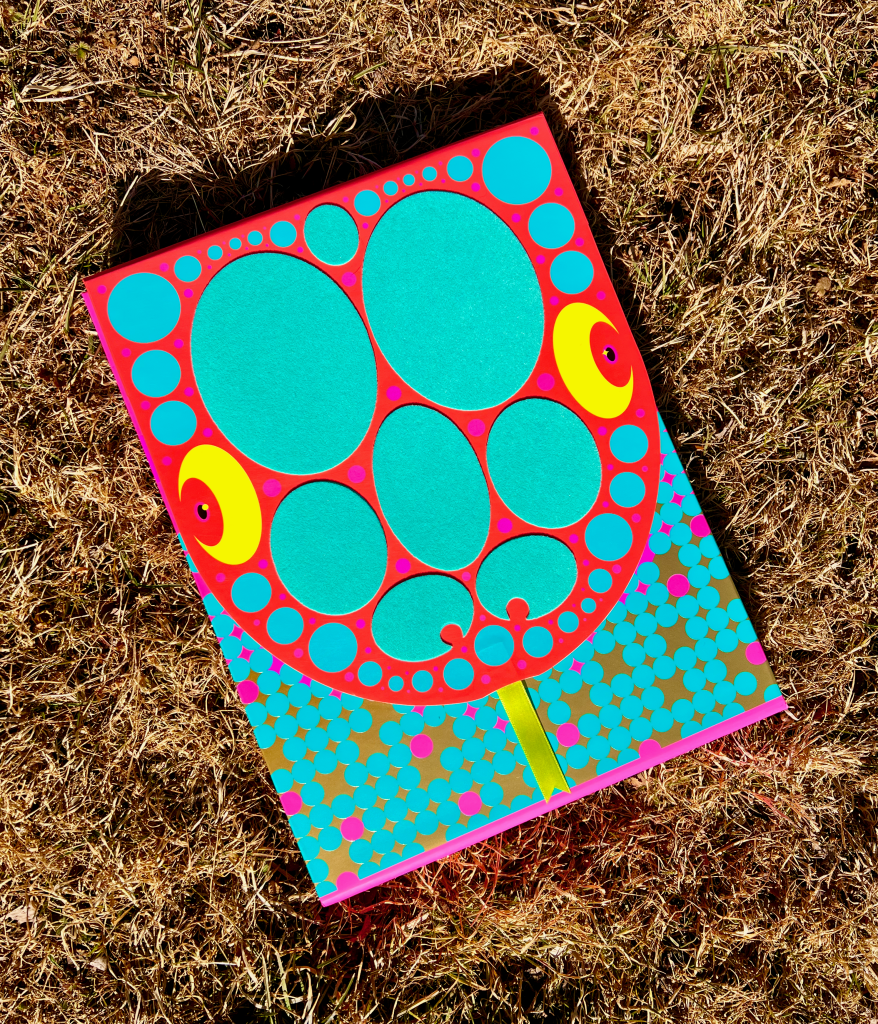
Veteran book designer and art director Paul Buckley was selected to conceive and design the book, which is nothing less than a marvel of production art and craft. The case is an abstract interpretation of a snake, comprising a pattern of felt ovals on a flap—the head of the snake—that is held shut by magnets and opened by pulling on a yellow ribbon, suggesting the reptile’s forked tongue. When the flap opens it reveals the American Illustration annual, with its 300-ish pages. Here Buckley briefly takes us on a serpentine journey through his processes.
What influenced your design of the current American Illustration cover?
There is an essay that [American Illustration Director] Mark Heflin asked me to write, which is at the very end of the book. In it I explain my lifelong fascination with snakes. Growing up in a large family in a three-bedroom Philly row home, coming upon garter and DeKay snakes in the empty lot next to our home was a revelation to my young grade school mind. That something that bejeweled and exotic could be found by flipping boards and concrete in our mostly tarred-over world was something I have never recovered from. To this day, if I can move the log and it’s above 50 degrees outside, I’m gonna look under that log. Like casting a trout line, maybe one time out of 50 you find something wonderful. I also grew up with illustration and fine art books and comics in the house and I particularly took great interest in illustrators, and was unsure as a kid which direction I’d pursue. When older, I went to SVA on an illustration scholarship and was a busy freelance NYC illustrator before I moved over to book design. A bit later in life when I could, I invested in some high-end breeding stock of pythons and Amazon basin emerald tree boas, and that was my Brooklyn evenings and weekends for quite a few years. And though I was a decent snake breeder, I lost money every year and disliked half of the people I was dealing with, and eventually left that world behind. To put these two poles of my life together in a visual art way was simply something I thought would be fun, a nonsequitur in a long career of projects that never allowed such freedom.
Were there any other ideas?
Not a one. … I can tell you it had zero to do with 2025 being the year of the snake.
Walk me, if you will, through the process of conception and creation.
I created this rough sketch on a utility bill envelope, and Mark seemed to get it. I then created this terrible 10-minute quick InDesign sketch so that Mark could start talking to printers about what we were hoping to achieve. Then I presented pretty much what you see as the final. Though I did a bunch of snake-themed spreads paced throughout the book, I had Brianna Harden focus on the rest of the interior, which came out wonderfully.
What were the bumps in the road, if any?
Because it is so multi-layered, and word spacing had to be leveled out just so in order to fit and flow with spacing that looked balanced, redoing the Jury Page a few times was the most arduous detail. I remember one of the jurors had received a title change, and simply figuring that out became a very long day, where everything had to be rejigged. I think Mark probably hit some bumps in trying to secure and figure out the production, from the flocking to the ribbon, and Brianna had at least one trim-size change to accommodate. But all in all, Mark is really great at seeing these complicated things through and juggling so many aspects of how to get the book done, while planning the party, while getting things moving for the next year. It’s wild how calm he stays through it all, and Brianna is a rock, as well. Such a great team.
At any time was there a prohibition or limit to what you were tasked to do?
The flocking took some bringing up a few times, but Mark is really into “gimme what you got and let’s figure it out.” The only detail that we could not afford was a three-sided top stain for the book edges. I would have gone to town on that.
How do you feel about the results?
I am super pleased with the results. I would have liked the snake tongue ribbon to have a deeper fork, so as to be more snake-y, and not just a V notch, but that was probably a tear issue or some such thing. After decades of “Paul, we cannot afford that, would you like the cover matte or glossy?” … I’m a pretty happy camper with this project.
The post The Daily Heller: American Illustration’s Snake in the Grass appeared first on PRINT Magazine.