When President Trump warned Ukrainian President Zelensky that he was “gambling with World War III,” palpable chills went up the spines of those who lived through the Cold War arms race. Heightened U.S. resistance to NATO is now encouraging Western allies to address their respective needs for nuclear weapons—so Poster House’s current exhibition, Fallout: Atoms for War & Peace (on view until Sept. 7), is not only timely, but it may be prescient, too.
Conceived and curated as two parts in the main gallery, Fallout is rooted in Dwight D. Eisenhower’s two significant speeches calling for engagement with Atoms for Peace and cautioning against the Military Industrial Complex. His words were the triggers for a huge campaign by America’s weapons giant, General Dynamics, which used sophisticated graphics designed by Erik Nitsche to control the Atoms for Peace narrative. Meanwhile, an increase of powerful nuclear weapons tests caused a backlash of protest. I spoke with the curators of the new show, Poster House Executive Director & Curator Angelina Lippert, and UK-based design historian Tim Medland, to weigh in on this emotionally charged exhibition.
(Note: Photos of the exhibition space designed by Kudos & KASA Collective are slated for a separate post later in the week.)
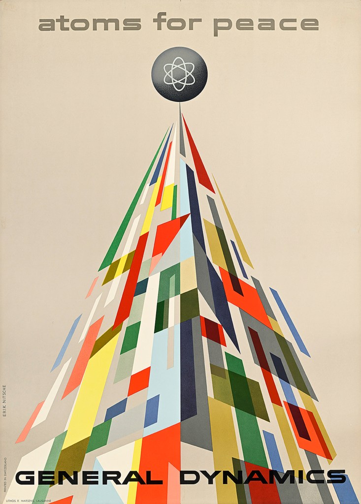
Design by Erik Nitsche, 1955.
Fallout: Atoms for War and Peace is an aesthetically stunning, informative look at the dichotomy that the world faced at the time, and the exhibition is divided in two conjoined segments. How did you select this format?
Medland: The two conjoined parts format was partially driven by necessity. Just presenting General Dynamics posters, despite the stunning graphics, would inevitably lead to accusations of glorifying a defense company; just showing the protest posters would lose part of the narrative of “how did we get here” and probably be too depressing. But doing the point/counterpoint format fills the great space, allows for extremely contrasting visuals, and also follow the pivotal Eisenhower narrative.
Lippert: There’s also just the question of chronology—most of the General Dynamics material was printed between 1955 and 1960. While we have some early anti-nuclear material that opens the show (most notably Hans Erni’s poster, considered the very first anti-nuclear piece), most of the protest work doesn’t show up until after the Cuban Missile Crisis. So, the exhibition design (brilliantly done by Kudos) underscores this break between corporate propaganda and protest—and we wouldn’t have the latter without the former.
Design by Erik Nitsche, 1955.
For many, myself included, the exhibition is an emotionally disturbing reminder of living through the nuclear age. Fear riddled much of the world, especially in the West. Was there a pivotal moment when the fear button was pressed?
Medland: The pivotal moment is probably the Cuban Missile Crisis. Before that Eisenhower warned, [the] CND [Committee for Nuclear Disarmament] marched, but every news-aware person living through the events of 1962 absolutely felt existential dread, and the understanding that simple events could spiral out of control.
Lippert: I agree with Tim that the Cuban Missile Crisis is probably the most pivotal global moment that resulted in millions of people suddenly becoming more aware of the imminent threat that nuclear war presented; however, even during that time, people were lulled into a false sense of security. Looking at the posters promoting fallout shelters from that same period indicates that a significant portion of the population felt that such an event was survivable, that only the “bad guys” (whoever they may be) would suffer. That idea that the powers that be could never let bad things happen to their populations continues through the ’80s—just look at When the Wind Blows, a heartbreaking satire on following government-issued instructions blindly while slowly dying of radiation poisoning. In my opinion, the fear button has both always existed for people attuned enough to see where an arms race leads and also not been pushed hard enough for those who walk through the world thinking that the worst isn’t possible.
You told me that this exhibition has a personal component. What is it?
Medland: I was a “forces brat.” I grew up on air bases, some of which were joint RAF/USAF bases, some of which were nuclear equipped. When I was a teenager my dad took me aside and said something along the lines of, “I may be on duty when nuclear war starts; if that is the case, take your mum and younger siblings, who will be scared, to the highest point in/by the base, tell each other you love each other, and it will be over in seconds.” Other than that, doing the research on “Protect and Survive,” the Peter Kennard posters, the Greenham Common protests and When the Wind Blows just brought back trauma, I guess.
Lippert: My connection is a bit less immediate in that it all predates my birth, but my dad’s father was in Los Alamos and, later, one of the men on Bikini Atoll testing the hydrogen bomb. We also have another member of staff on our design team who is only alive today because the bomb was dropped on Japan—without that horrible event, her grandfather would have died as a kamikaze pilot a few days later. I personally find it really powerful that three people from different countries can have such wildly different connections to this history, and end up working together to make a show about it.
Design by Hans Erni, 1954.
The mushroom cloud became a charged symbol for the No Nukes movement, and yet it was also used in a trivial manner on souvenirs, etc. How do the two implications balance out?
Medland: The mushroom cloud became an iconic image. We are all drawn to iconic images; it is hard to speak to the mindset that gets lulled to sleep by the end of the world, but I understand that powerful images are the ones we all love.
Lippert: I think this stems from the concept that we all become desensitized to horrible things that we see everyday, and powerful symbols (even ones that imply horrible things) have a certain sex appeal to them, for lack of a better term. One of the largest producers of dorm room–style posters once noted that its most popular design was the one of the female tennis player hiking up her skirt to reveal a bit of her butt; its second most popular design was the mushroom cloud. That means that a lot of young men had butts and bombs in their bedrooms or rec rooms growing up. It’s been so long since we’ve had the threat of nuclear war that I don’t think the mushroom cloud carries the weight it once did—it’s more kitsch than warning of things to come.
You point out in the excellent exhibition wall texts that nuclear weapons increased after President Eisenhower gave his second “Military Industrial Complex” cautionary speech. What impact did his words have on the poster designers of the day?
Medland: I think the first Eisenhower speech, the Atoms for Peace, had an effect on politicians and technocrats, but little to no public impact. I think the second speech, the warning about the Military Industrial Complex, has become more understood over time. After all, he was stepping down, and the photogenic JFK was due to arrive. Really, as I have said, the pivotal moment was the Cuban Missile Crisis.
Lippert: I agree—I don’t think Eisenhower’s words really had that much of a direct impact on posters, but more that the heightening global tensions around the arms race led to a more pervasive understanding of the catastrophic potential of these events.
Did the graphics have any immediate or lasting effect on the masses?
Medland: I think (as someone who remembers the immediate effect of the posters) that the warning text and images absolutely did have impact. They mobilized public opinion and raised voices.
Lippert: It always depends on who interacted with those posters and where they lived. The sheer fact that we have so many in this exhibition tells me that they were important enough to someone that they saved them this long. They aren’t beautiful decorations, so clearly the message was powerful enough to inspire preservation. Looking at the show at large, though, I actually feel the General Dynamics posters had a larger impact on “the masses” than the anti-nuclear posters in that they are constantly cited by designers as major points of inspiration. Even though they’re corporate propaganda for a company that many would take massive issue with today, they are some of the most beautiful posters of the Midcentury period—and to deny their impact would be naive. On the flip side, I think Peter Kennard’s posters were tremendously impactful in the United Kingdom, but mostly because he was backed by the Greater London Council, who allowed those images to permeate so many communal places in the average person’s life—laundromats, post offices, schools, etc. If a poster is given a wide enough circulation, and enough people see it repeatedly, it will have a greater impact than one that doesn’t have that level of saturation into the collective consciousness.
Design by Peter Kennard, 1980.
Atoms for Peace was a devious bit of positive propaganda, and Erik Nitsche was hired to brand the concept. What was the solution to this “problem” and its outcome on the public?
Medland: This is Angelina’s wheelhouse, but the vibrant, abstract nature of the General Dynamic posters, and the pride in scientific progress they undoubtedly engender, impressed the corporate, political worlds and the general public. At the end of the day, this was I guess a time of great optimism, especially among the (white) American public.
Lippert: I think we have to be careful on how we define “public” here. The first posters were primarily used at what was essentially a convention for scientists in Switzerland, so the audience wasn’t really the general population. The later series were also not as street-facing as most advertisements and served more as corporate propaganda that you’d see in your office’s break room (provided you worked somewhere that had a relationship with General Dynamics). Yes, the public could send away for a pack of postcards or buy the corporate history—or even go to the General Dynamics exhibition in Rockefeller Center, but even that was a fairly niche slice of the population.
If you’re asking how Nitsche solved the idea of presenting peaceful uses of atomic energy in graphic design, I also have to say that I don’t believe he was fully aware of everything his employer was doing. Most of that information would have been classified, so he was just a designer with a track record of elegantly interpreting scientific concepts into eye-catching, modern and digestible charts and presentations—and he was given a brief to interpret the dawn of an atomic age whose new symbol (at least for General Dynamics) was a nuclear-powered submarine.
As I was looking at the posters, I suddenly wondered why there was a need among General Dynamic’s leadership to invest in such a campaign.
Medland: General Dynamics was a new company; it came into existence in 1952. Lockheed, Boeing, Raytheon, Northrop were all in existence—but GD was building the “new stuff,” nuclear submarines (the most deadly weapon ever created) and the missile systems that actually carry the nuclear warheads. There were other U.S. companies such as Westinghouse and Bechtel that actually built large U.S.-based nuclear power plants—but to be fair to GD, they produced the Triga research reactors, space nuclear thermal propulsion, nuclear medicine programs and other peaceful projects. In a short answer to your question, I think it is a bit like the London Underground posters we have in the downstairs hallway show—a visionary CEO believed in the power of high-quality graphic design to let people know his entity existed and could make their life better. Strange as it seems now, there was a school of thought (and probably remains in some people) that nuclear weapons as the ultimate defense system make life better.
Lippert: They also simply wanted to make a splash at the conference in Geneva. That’s just pure smart marketing—have the best booth at the convention and the people will pay attention to you. If that first series had not been successful, none of the other General Dynamics posters would have been printed. The CEO merely took a risk and it paid off.
Was Atoms for Peace sincere or a subterfuge for building nuclear weaponry?
Medland: I will never know. But to return to my previous answer, I can believe that it was sincere—people like technological progress—and the atom has, thus far, been a net positive. It is just that if it ever is not, it will be beyond catastrophic.
Lippert: Eisenhower’s Atoms for Peace speech and the subsequent political efforts to provide nuclear technology, supply chains and training to countries that agreed to only use it to produce power stations was a sincere, though entirely politically motivated, effort. Yes, it was also a way to get nonaligned countries to saddle up to the USA during the Cold War—but the Soviet Union quickly came up with a comparable program, so that’s a bit of a moot point. If you’re referring just to the poster campaign, I believe that the people working there felt like they were doing good, patriotic work. I don’t believe most individuals are capable of waking up and truly believing they’re the bad guy every day. These posters are showing what this type of technology can produce, which is everything from cutting edge cancer treatment to space exploration—which sounds super exciting for people on the frontiers in those industries. At the same time, General Dynamics, being a massive company with many divisions, also acted as a weapons manufacturer.
Design by Peter Kennard.
Where are we now? In the age of Trump, is the world going to be insecure again?
Medland: I personally am not drawn to dramatic statements. English repression runs deep! It is a matter of record that recent U.S. political developments have led leaders and the broader public—particularly in Europe, but also in Asia and even in Canada—to doubt (for the first time ever) the U.S. protective military umbrella. It is worth noting that the world that we live in was designed by U.S. policies in the late 1940s, and the U.S. has benefited massively from this. The world is now insecure—democratic countries that have never wanted nuclear weaponry are openly talking about the fact they may have to develop their own weapons, which they would absolutely have the capacity to do.
Lippert: As someone slightly younger than Tim, this is the first time in my (conscious) lifetime where the idea of a real nuclear threat exists, and that level of insecurity is very new to anyone born in the 1980s and beyond. Looking at these posters, though, you can see a pattern where every time there is a new nuclear threat, the public pushes back until there’s a political recalibration and “cooling off” period. I imagine that we will soon be entering a similar period where the threat escalates until the public responds and (hopefully) turns the tide yet again.
In addition to the posters which sanitized the notion of mutual destruction and nuclear winter, what other campaigns did you find?
Medland: The Disney “our friend the atom” and other corporate propaganda films from the 1950s sanitized the risks—but I do not believe that any rational being at the individual, corporate or government level would now try and present a sanitized version of inevitable mass destruction. I think the early 1990s Peter Kennard, When The Wind Blows, etc., satirical destruction of Protect and Survive ended any attempt at projecting a hopeful outcome
Lippert: My favorite thing after an exhibition opens is when people start sending in material that they wish we’d included in the show. A few members of staff have already shared Japanese animated films about the horrors of the atomic bomb, and others have pointed to different movies than the ones Tim and I highlighted as “must-watch” events. We also have at least 50 other posters in the museum’s collection that we could have included if space permitted, all of which touched on different aspects of nuclear protest or proliferation.
The post The Daily Heller: Branding Atomic Destruction appeared first on PRINT Magazine.