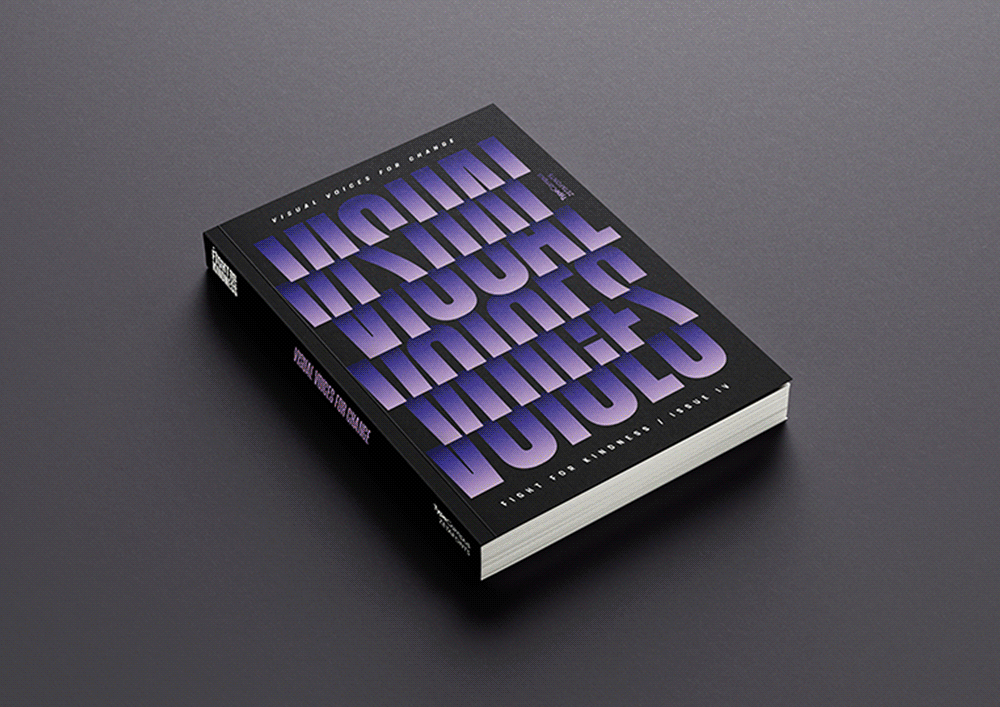
Visual Voices for Change — Global Typographic Posters gathers 600+ posters created by designers from all continents and exhibited in more than 20 exhibitions worldwide. The shows were part of the global Fight for Kindness campaign by TypeCampus, sponsored by the Italian foundry Zetafonts.
Here is an adapted excerpt from my foreword to the book:
“Type and typography designed with kindness as a goal is … a vexing proposition. Is not all type design at its core created with human(ist) values? The very purpose of type is to support and encourage literacy; and is not literacy a kindness in its own right? To be literate is to be freed from the darkness of ignorance. In fact, this is much more than kindness — it is a human right.
“In the universe of letterforms, there are, however, some designs that fail to meet this responsibility. These can be considered unkind. Typefaces that are difficult to read and abhorrent to behold are in this category. Still, arguably, type designers rarely take on the intensive task with a goal of harming others. There should be no victims of typography … but there are faces used to send—and be interpreted as—exclusionary and mean. In the end, judgement is a matter of context. Blackletter typefaces, for instance, embody a menacing air, while most scripts exude a celebratory sensibility.
“I find that the kindest forms, ornamental typefaces, are pleasing to the eye—they bring a sense of play to a typographic message. But this is not always the case. Typographic kindness is in the eye of the beholder and depends not simply on the intent of the designer but the capacity of the receiver to navigate the meaning of what is typeset …
“Kindness is in short supply in the world in which we live. Graphic design is a small artform that plays a large role in people’s lives. Injecting kindness into visual communications is in itself a great kindness.”
The post The Daily Heller: Can (Typographic) Design Emote Kindness? appeared first on PRINT Magazine.