Many graphic designers I know (and most visual artists) shop at one of Trader Joe’s’ various locations around New York City. They go for the comparatively cheap prices of incredibly good products—not for the artwork, although it’s hard to ignore it. Trader Joe’s decidedly has one of the most engaging graphic identities of any supermarket chain, and Julie Averbach took notice. After devoting her Yale art history thesis to the chain as a contemporary cabinet of curiosities, she wrote the book The Art of Trader Joe’s: Discovering the Hidden Art Gems of America’s Favorite Grocery Store. It is not just a paean to clip art transformed, but a serious study of original source material from TJ’s boxes, bottles and displays. I asked her about the inspiration for this “unauthorized” survey, and the passion she has for this artful showplace of consumption.
What inspired you to do this book?
To me, some of the most interesting art is woven into our everyday lives. I like the idea of giving everyday things, like a cereal box or a soda can, the same level of appreciation as we would an oil painting in a museum.
Trader Joe’s is a perfect example of art in the everyday world. The grocery store is a treasure trove of art, from the product packaging to handmade murals and signs. Trader Joe’s’ art blurs the line between “high” and “low” art, merging the world of the art museum with that of the grocery store. The brand’s peculiar devotion to art inspired me to write my Yale art history thesis, and later a book, on the subject, giving readers a fresh perspective on what we might otherwise take for granted.
I went to my first Trader Joe’s in Los Angeles before they opened in New York. When did you have your first experience?
My “aha” experience came in early 2021. During pandemic lockdowns, I watched a documentary called Helvetica on the history of typography. It opened my eyes to typography as an artform that surrounds us every day, but that we rarely notice. Helvetica inspired me to go out into the world and look for interesting typefaces. I knew that Trader Joe’s used creative lettering on their products, so that was my first destination. As soon as I paid attention to the packaging at Trader Joe’s, I realized that the entire store was a trove of art. One of the first artworks that caught my eye was the ancient Roman sculpture Augustus of Primaporta on their Caesar salad label. After that, I started looking closer at every product, mural and sign, and became enamored with Trader Joe’s art. Over the last four years, I visited more than 150 Trader Joe’s stores across the country, searching for their most amusing and awe-inspiring artworks.
Why is Trader Joe’s named Trader Joe’s? Is there a real Joe?
Yes! Trader Joe’s was founded by a man named Joe Coulombe in South Pasadena, California, in 1967. Joe Coulombe once said, “Trader Joe’s is for overeducated and underpaid people, for all the classical musicians, museum curators, journalists.” [1] He wanted the store to have an intellectual and artistic appeal—to satisfy our need for groceries while also feeding our cultural appetite. Coulombe’s legacy lives on through Trader Joe’s today, as artistry is woven into the brand’s identity.
Trader Joe’s is known for its reasonable prices. (And the store near me always has multiple lines snaking through its aisles.) Given it does so much house-branding, does having its own art department help keep product costs down?
Over 80% of Trader Joe’s products are private label, where Trader Joe’s cuts out the middleman to secure lower prices for customers. In most grocery stores, private label products are wrapped in generic designs, often with a product photograph and simple title. This basic packaging signals to shoppers that these items are less expensive than national brand equivalents. At Trader Joe’s, private label products gain a premium status through their packaging. Trader Joe’s designers use eye-catching graphics, bold colors and expressive typography, crafting a distinct visual identity for each product. By harnessing art and design, Trader Joe’s gives customers the best of both worlds—an affordable house-branded product with an aura of uniqueness and luxury.
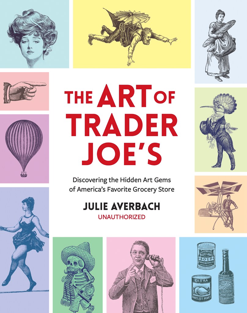
The cover of your book includes a grid of familiar copyright-free clip art. Why did TJ decide to use this literal cliche art?
Trader Joe’s founder, Joe Coulombe, collected Victorian print ephemera. When he started the newsletter for Trader Joe’s in the 1960s, Coulombe started clipping images from his personal collection and incorporating them into the store newsletter. He knew these images belonged to the public domain and were free to use. Sixty years later, Victorian art is still a mainstay of Trader Joe’s’ brand.
As part of my research process, I memorized the Victorian images in Trader Joe’s’ artworks. I then spent countless hours at the New York Public Library flipping through 19th-century magazines and periodicals, challenging myself to uncover the original sources. This archival treasure hunt turned into a game for me. I was exhilarated each time I found a match. One of my favorite finds was the deep-sea diver cartoon from Trader Joe’s’ Scandinavian Swimmers gummy candies. By examining decades of issues of La Nature, a French science journal, I traced this image back to an 1874 article about innovations in diving technology.
Whenever I shop at Trader Joe’s now, I think about how each of these images carries a rich history. The Victorian cartoons have lived many lives over centuries. Their appearance at Trader Joe’s is just the most recent chapter.
What do you think are the high and low points of the packaging, signage and wayfinding designs?
Trader Joe’s art is fundamentally eclectic, a mishmash of diverse sources of inspiration. While conducting research for the book, I would walk the aisles, examining the products through an art historical lens. I discovered a mélange of cultural references on Trader Joe’s shelves—Art Nouveau prints adorning their wine labels, Ethiopian baskets on the Ethiopian Coffee bag, even grocery-themed tributes to iconic works like The Starry Night. For me, the high point is witnessing how Trader Joe’s artists borrow from pre-existing works and transform them into something new. The low points are when a product appears in a solid package with simple text, omitting any art reference whatsoever. This strikes me as a missed opportunity to engage and delight customers.
The store has a hybrid South Sea island cruise motif attached to it, but it is more than an island pastiche. How would you describe the overall brand design?
That’s right—travel is at the heart of the Trader Joe’s brand. The stores embrace a campy nautical theme to convey trade and exploration, with props like nautical bells and oars stationed at checkout stands. The products on the shelves represent a diverse global selection, from Danish Butter Cookies to Korean Jumeokbap and Portuguese Donuts, all packaged to convey their distinct cultural identity. Through art and design, Trader Joe’s inspires imaginary globe-trotting from the convenience of your own neighborhood.
Trader Joe’s’ worldly branding approach is unique. In most supermarkets, global foods are isolated to a specific aisle. Decisions about which foods are assigned to “ethnic” or “international” aisles reflect shifting and charged assumptions about American identity. At Trader Joe’s, the entire store is an international aisle.
You say that your book is not “authorized.” Why not?
My book is not authorized or affiliated with Trader Joe’s because it reflects intellectual independence from the company. The book was written from my perspective as an academic with an art history background, not as corporate messaging from Trader Joe’s.
What is the most surprising discovery you’ve made about any aspect of TJ’s off-brand brand strategy?
Much of the most interesting artwork at Trader Joe’s hides in the places you least expect to find it. One of my most surprising finds was at a Trader Joe’s store in Chicago. As I was admiring the artwork in the store, I glanced over at the elevators and saw the doors parting. To my amazement, there was a parody of Grant Wood’s American Gothic inside. A Trader Joe’s artist created a double portrait riffing on the art history icon, in this case dressing up the Midwestern farmers to resemble Trader Joe’s employees. I was delighted to see this unlikely parody in a grocery store elevator. I rode the elevator up and down repeatedly to admire the work, much to the confusion of my fellow elevator passengers. This discovery opened my eyes to the art that hides in unlikely places, whether in a Trader Joe’s bathroom, parking lot, or even a trash can. Nothing is too mundane to become a work of art at Trader Joe’s.
Another revelation has been the extent of Trader Joe’s’ commitment to art, unlike any other national retailer. In every Trader Joe’s, there are in-house artists crafting each sign by hand, from the small shelf labels to the large endcap signs. These artists often work in hidden art studios within the grocery store. The art is also ephemeral. As seasons change and the product selection rotates, signs are scrapped, redone and replaced. This makes each Trader Joe’s an ever-changing art gallery; you never know what you’ll discover when you step inside. Across about 600 locations, Trader Joe’s artists create tens of thousands of original artworks each year. That’s an astounding amount of artistic production for a grocery store.
Since the 1960s, Trader Joe’s has grown from a niche California grocer into a pop culture phenomenon. I believe art is an essential ingredient in this commercial success. On a subliminal level, the art fuels our cultural obsession with Trader Joe’s, attracting a cult following unlike any other grocery store.
[1] “Joe Coulombe, Founder and Namesake of Trader Joe’s, Dies at 89,” NPR, Feb. 29, 2020.
The post The Daily Heller: Clipping Art at Trader Joe’s appeared first on PRINT Magazine.