If Kelli Anderson could be characterized as a modern designer, I would have no difficulty introducing her here. But she is not simply modern, she is moredern. Her work does not pick up where Futurism left off; rather, she continues analog traditions while using digital tools in order to develop alternative futures. Anderson was schooled in art that rejected tight constriction, yet she does work that demands close attention to precision in both content and form.
Her favored metier is paper engineering—a fragile and time-consuming process that seems anachronistic in the digital present. Nonetheless consistent with the demands of the digital world, her various “inventions” (including a pop-up book that shows how a camera works and allows the reader/user to actually take photos) are intensely interactive and decidedly playful without being screen-based.
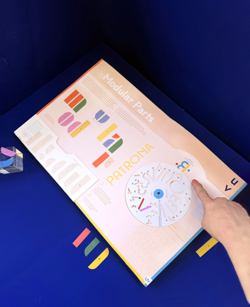
Her forthcoming opus, Alphabet in Motion: How Letters Get Their Shape, takes the user on a journey of typefaces from an architectonic perspective. This is not a specimen or font-making handbook, it is a true rabbit hole to the interior world of letterform construction. In advance of its publication in November, Anderson discusses the mechanics of this essential guide and experimental document.
Given the tsunami of AI bells, whistles, kabooms and blowhorns, it is so refreshing to see and touch your brilliantly engineered and conceived history of the alphabet. You’ve done various complex, time-consuming assemblage books, so the question is, why turn to type design and production history at this moment in your career?
My books help people look out at the world around them and ask, “why is it that way?” I got curious about type because, as a graphic designer, I have used and felt type’s power firsthand—but had no idea why type works the way it does. That one typographic choice over another can conjure a spell over the text, enveloping it in a thick atmosphere or even bending the meaning of its words, feels supernatural. It’s similar to the way a sound may be described as acousmatic if the thing or person making it remains unseen (a term hearkening back to when Pythagoras hid behind a screen to lecture to his students). The mechanics of typographic aesthetics are deeply felt, but the origin is mysterious. I studied art history in school, so I suspected that it wasn’t just vibes. The stonemason who carved the letters on the Trajan column and the designer of Futura certainly had very different hopes for the future, which got expressed in those letterforms. So I dove into a five-year research project to better understand the ideas, history and production methods that shaped our typographic present.
And I think you’re right—this book is a reaction to frictionlessness AI, which operates in a space of pure wish fulfillment, outside of history and context. But I think, as humans, we all crave and need orientation in time and space. Letterforms are all around us as we move through the world, providing a comforting and reliable index. And it’s easier to understand their history through play.
Was (is) this the most complex of all your inventions to date? And would you call them “inventions,” “concoctions,” “infographics” … or what?
Yes! It is the fault of the Latin alphabet. There are far too many letters better A and Z—and each one needed a pop-up.
I’d call the pop-ups explorable explanations. When talking about type, you’re up against this highly technical history, where many important inventions that shaped our world are now completely absent and obsolete. (How many people know how phototypesetting works?) These topics are challenging to trace in text or in diagrams alone. In art history, we guide looking by saying “follow the artist’s hand.” But while most of us have held a paintbrush or molded clay in our lifetimes, few of us have typed a sentence on a Linotype compositor.
While this book can’t recreate the experience of holding lead type in your hand, I figured that there absolutely is a way to simulate the technology of phototypesetting using a pop-up and a smartphone, and thereby make its affordances legible and tangible to a modern audience.
What was the most difficult element of this decidedly challenging project? What gave you the most agita as you conceived the method and production?
I had pieces of history that I found interesting, specific typefaces that looked gorgeous, and pop-up mechanisms that I wanted to use. The biggest challenge was figuring out how to get those three different levels of experience (text, design and interactive components) to effectively support each other in the expression of a concept.
For example, the pop-up for ‘C’ spins and rotates along a 2D plane as it transforms into a ‘D’. This is a very good physical metaphor to express the concept of modular parts in type design—that harmony is created across an alphabet when each letterform remixes parts of another. I wanted the pop-ups to be in service of the reader’s comprehension of the book’s topics, and not just be entertainment.
I’m interested in what milestones you chose to highlight. I understand sections on phototype and modular parts, but what was the impetus behind “A Mood of Technological Optimism”? What are you saying in this tableau?
In choosing what to highlight, and what dots to connect, I mostly followed my own curiosity. For example, the letter ‘R’ is all about superelliptical letters. The kind of letters you see on NASA’s projects and technical manuals for early 1980s video game systems. These letterforms have such a potent vibe of optimism about a technological future, like a very Jetsons, Tomorrowland-y feel. I thought … was there a “typographic identity of technology” committee that decided upon this look? It’s endemic! Really … watch any science fiction movie and you’ll see superelliptical type all over every button and interface.
It turns out that in the late 1950s, a poet and recreational mathematician named Piet Hein catapulted the superellipse into the public consciousness, first through the design of the Sergels Tor roundabout in Stockholm. Before the ramp-up of the Space Race era, It was not possible for industrial manufacturing to produce such sophisticated mathematical shapes. So the fact that Hein could then start designing dishes, TV screen glass, tables and toys for a mass public, was an expression of his own interest in the shape, but more importantly, an expression of incredible progress in humanity’s mastery over the elements of industrial manufacture. Which is why this shape is so indelibly iconic as “mod.” And why its presence is so reassuring on the dashboards of spaceships, as the wall between climate-controlled indoors and the extremes (and inevitable gruesome death) of outer space.
You incorporate modern tech (e.g., the smartphone) and handmade materials into the functional apparatus of the book. What inspired you to go from old to new tech? And is this endemic to all your paper engineering?
The premise of the book is that you can’t untangle the human and the technological—not from history, not from aesthetics, and maybe we can’t even tell where we end and the technology begins. We shape it and it shapes us. When I am walking around the city, my smartphone is now an extension of my brain. I rely on it for cognitive offloading, so I don’t have to memorize phone numbers or remember biking directions. So in a lot of ways, I forget that I am holding a tool in my hand, as it begins to seamlessly represent my intention. Our relationship to letters, words, writing and typing is exhibit A for this type of blurring between self and technology.
The book itself is also a tool, one for understanding the topic of type. When I first began considering making this book, I knew that to promote understanding, the book had to offer readers a more embodied experience that would get their hands, as well as their minds (and smartphones), engrossed in letterforms. I reflected on the tangible experiences that served as the gateway drug for my obsession with typography—perfecting the loopy curves of my penmanship in grade school, being astonished by the leaden weightiness of metal letterpress type, making rubbings of tombstones in design class to study their serifs. We simply have to interact with things to understand ourselves and the world. Tool-making and using is a big part of being human.
It is obvious that you are a perfectionist. How far are you prepared to take these extremes? What do you demand of your publishers to get the desired result?
A funny thing about making a pop-up book is that you have to make it twice. The first time, you are making it with homemade tools on your desk. The second: with industrial printing equipment. In order to get the effect of the pop-ups to be the same, you oftentimes have to build it in a completely different way. And as a designer, you don’t understand how to use those machines of industrial manufacture, so you are relying on your printer/print broker to do the translation work.
So you have to communicate clearly (lots of diagrams, videos, mockups, etc.) but you have to have a very good, close and responsive relationship with the people who are manufacturing the book. That requires maintenance, being a good coworker, answering emails quickly, truly understanding the ins and outs of each mechanism. I don’t think you necessarily have to take it to extremes, but you do have to embark on the second project of scaling it. Making one book and making 25,000 books are two very different types of projects!
What should I walk away with from this book? What should the non-designer/typographer learn from what you’ve done?
That type is far more interesting than we’ve assumed. If you look carefully, you can see the history of the world in the microcosm of type.
After reading this book, when they walk down the street, I want readers to begin to see histories unexpectedly merged on a painted bodega sign; I want them to imagine that the type embossed into electrical boxes secretly reveals the dreams of its maker. I want them to notice corporate power whitewashing itself as benign-blandness (cough, Helvetica). When I first began paying close attention to what typography was doing, listening for its subtle voice, it changed the level of sensitivity with which I took in the world—almost like adding another dimension to what I could see. I wanted to package that up (as neatly as possible) and put it in reader’s hands.
The post The Daily Heller: Kelli Anderson’s Moveable Type appeared first on PRINT Magazine.