Most typographers have probably never heard of Ruth Libauer Hormats and her brother, Robert Libauer. But if Jeffrey N. Levine had his way, the duo would be elevated from a footnote to a major paragraph, even a chapter, in the history of type and letters. Levine, a Florida-based type designer, is on a mission to raise the Libauers’ profile and celebrate the magnitude of their typographic invention.
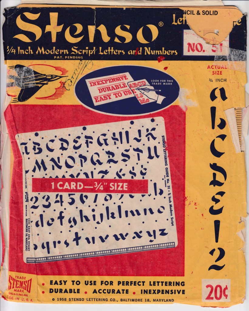
In the 1940s, Ruth created and Robert marketed an easy-to-use stencil letter drawing system for the student, teacher and basic do-it-yourselfer that made drawing lettering for signs, displays and book reports much easier and more efficient. Ruth was a Baltimore teacher and although she did not invent the stencil process, per se, her Stenso guide sheets produced on heavy cardboard (or oak tag) were state of the art long before photo or digital type. “The Stenso Lettering Guide was so unique with its spacing holes (called ‘indicators’ by Hormats) that she submitted her patent design in 1940 and was awarded a patent for her invention in 1942,” wrote Levine in an online article titled A Brief History of the Stenso Lettering Company. Even Macy’s, the world’s largest department store, promoted the product’s versatility through live demonstrations.
Stensos came in various sizes and families, including Gothic, Old English, Frontier, Modern Script, Art Deco and even Hebrew. It was a significant material departure from the standard brass stencils originally used for marking crates and bales filled with tobacco, cotton and all manner of consumer goods dating back to the 18th century and before. Paper stencils were also used during the Victorian period in very intricate compositions and applied to wood boxes and other surfaces as identification and advertising. Stenso borrowed from these traditions but was not simply rogue type. Stenso was to type design what military music is to music—decidedly functional yet not nuanced and, by fine typographic standards, comparatively unattractive. Nonetheless, in the same way that booming marshal rhythms have been incorporated into classical and popular music, the stencil lettering style has long influenced sophisticated typography and graphic design, and for some curious reason continues to do so. For example, Levine has designed over a dozen stencil alphabets of his own, including Stencil Gothic and Maverick, a stencil version of a bifurcated Tuscan “frontier” typeface.
Stencil lettering, characterized by breaks or channels of empty or negative space between portions of each letter, never really went out of fashion. If one considers fashion to include “Post No Bills” signs, military labels, parking garage directional signs, and the Boston Police and Fire department logos (the last are variants of Futura Black), stencil is perpetually with us in a quiet, vernacular way. Yet for the past few years it appears to nonetheless be coming back into style in a big way. In case you’ve not noticed already, even the masthead of the very publication you are reading is a stencil typeface.
To pinpoint the exact moment (and specific example) of this seeming renaissance would be difficult, but perhaps one of the most visible examples was the logo for the rappers Public Enemy. Then there was the logo designed by Drew Hodges for the 1994 RENT, the urban musical based on Puccini’s La Boheme. It seemed to be logically based on the original logo designed by Saul Bass for the movie version of the musical West Side Story, but according to Hodges that’s not the case. “It was supposed to be what the leads in the play would do if they were to make their own logo. This was back in the day before everyone had Photoshop, and I walk to school five miles in the snow with no shoes ’cause my horse was sick,” he says. Whatever the rationale, the stencil certainly evoked the “downtown,” Bohemian, post-no-bills, gritty plotline involving a gaggle of impoverished young artists and musicians struggling on New York’s Lower East Side during the AIDS epidemic. Stencil said it all.
The post The Daily Heller: Old Design Tools for an Aging Generation appeared first on PRINT Magazine.