A few years before social media gave everyone the chance to broadcast public grievances to their heart’s content, I received a barrage of ire for what became my infamous essay “Cult of the Ugly” in the summer 1993 issue of Eye magazine. At the time, I got my knickers in a bunch over a new wave of distressed digital typefaces that were being applied to gazillions of design projects by students and young professionals worldwide. Layout and page design were entering a so-called Postmodern or grunge phase, underscored by erratic typography that was splattered rather than “composed.” It was the age of unlimited experimentation and it took a few years for me (sometimes late to the party) to accept the shock of the new.
A few years after enduring the storm of criticism about the essay (about which I still get the occasional student query), I pivoted and produced a book titled Faces on the Edge, an apologia for my earlier critiques of what I came to understand as the natural evolutionary adaptation of young designers and the unique opportunity of digital technology. In retrospect, most regrettable were my rants about Emigre magazine’s layout and typography—at the time I believed Emigre fonts were the seeds from which typographic devolution grew.
Until it became crystal clear the opposite was true.
I changed my mind in large part due to the high quality and smart editorial work of the specimen books and posters that I received in the mail from Emigre Fonts, through which Rudy VanderLans and Zuzanna Licko were rigorously carving out new standards of digital type design. The specimen booklets were in and of themselves impressively designed and authored. Today they stand as seminal artifacts of the digital age.
I collected each Emigre booklet with the same enthusiasm and zeal as I did German New Typography and Bauhaus documentation … until last year when I gave my large personal archive to SVA’s Graphic Design Study Center. I had originally held back folders containing the Emigre materials, reluctant to no longer have immediate access to them. Then I learned that the Letterform Archive, where the Emigre Fonts archive permanently resides, planned to publish a 1,264-page chronological reproduction of all the specimen booklets—including many I was missing.
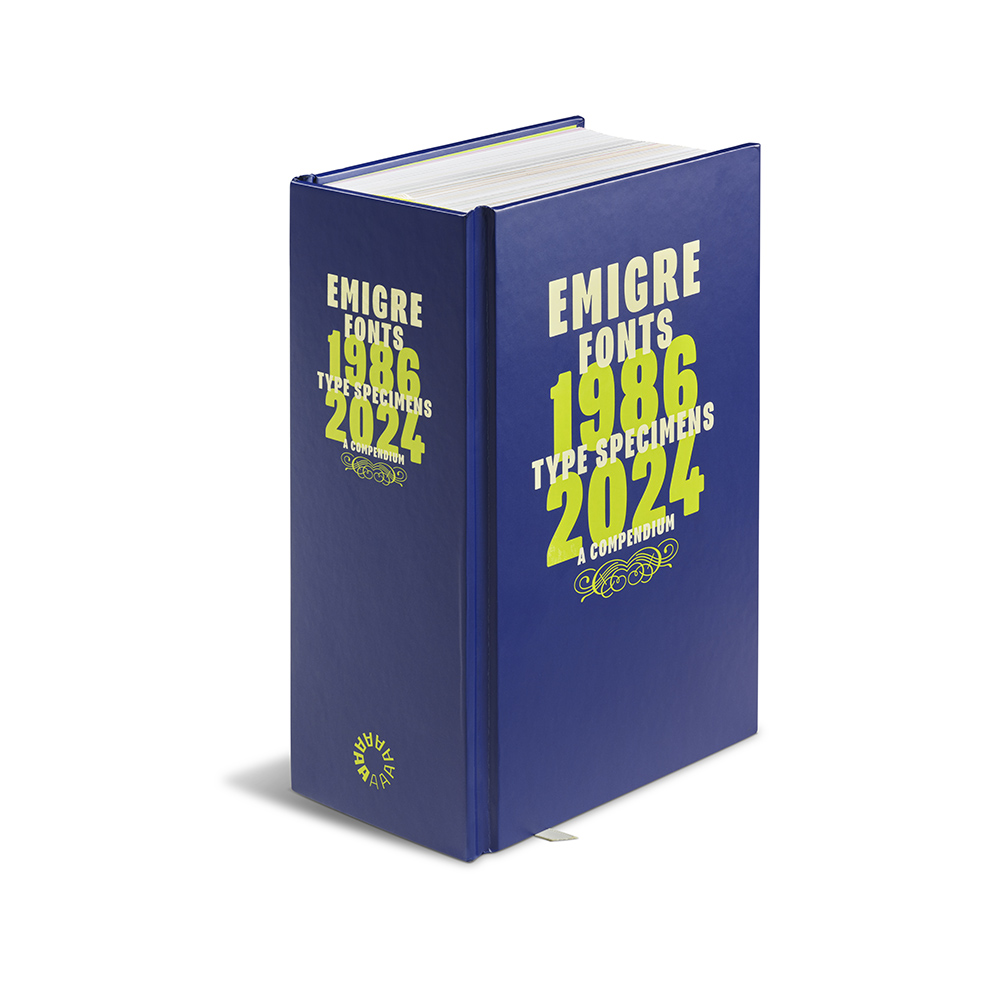
Emigre Fonts 1986–2024 Type Specimens: A Compendium is a complete record of Licko and VanderLans’ achievements, solidifying their individual places in graphic and typographic design history. I would not be surprised if this book had been Licko and VanderLans’ plan almost from the beginning when they decided on a standard format for their dispatches. The result, amounting to this brick of a book, is the most accessible reference that a practitioner, historian and type fan will ever need. It is timeless and entertaining (I spent hours just casually flipping through and admiring the page designs for each font family). It includes lengthy illuminating essays and commentaries by David Barringer and Emily McVarnish, as well as shorter front-of-the-book texts by Stephen Coles, Mr. Keedy and VanderLans. It is beautifully printed and bound. Most important, the volume shows, demonstrates and, indeed, personalizes the varied characters of the styles, faces and decorative materials that established Emigre Fonts as the premier independent digital foundry in the (Western) world.
The post The Daily Heller: The Fontastic Emigre Specimen Encyclopedia appeared first on PRINT Magazine.