Go back in time a few weeks to when Steven Brower spoke about his book Roy Kuhlman: The Reluctant Modernist for the Print Book Club. One aspect of the project that we did not discuss was the release of his bespoke Kuhlman typeface. It was Brower’s idea with Craig Welsh, who then brought in David Jonathon Ross, who did the heavy lifting.
What was the rationale for selecting this particular hand-drawn aesthetic from Kuhlman’s repertoire?
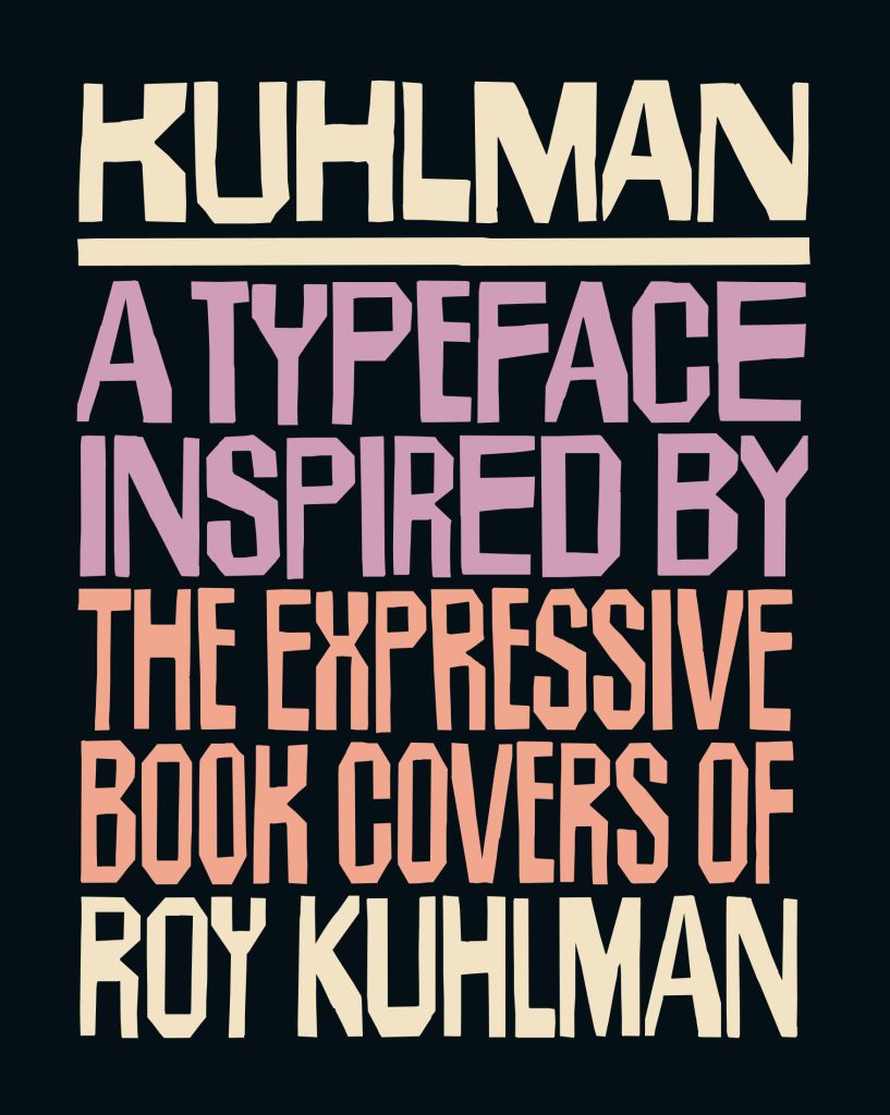
Steven Brower: “Timeless” gets thrown around as much as “genius,” but I believe both apply to Kuhlman’s metier, and in particular his handlettered typeface, which is instantly recognizable. During its time it was seen as “Beat.”
Other than a worthy homage to Kuhlman, did you expect the face/font to have legs?
Brower: Since it was released in November, it has gone way beyond my expectations. It has been adopted by the L.A. Dodgers, a CNN documentary on Bad Bunny, a theater company, a soft drink and more.
David Jonathon Ross: I’ve been releasing fonts for long enough to know that I can never predict what will get used a lot and what won’t. I don’t think of myself as someone who is particularly sensitive to user tastes and design trends … I’m more of a broken clock hoping to be right twice a day.
That being said, I’m thrilled to see how Kuhlman has been getting used! Thanks to Steven and Craig’s research, I love that we’ve been able to bring some new attention to this fascinating corner of Roy Kulhman’s work. At the same time, I love that familiarity with Kuhlman’s oeuvre is not a prerequisite to use the font—the style has a raw communicative power that takes on a whole new life in the hands of contemporary designers, even ones who may have never heard of Kuhlman the man. And with a plethora of OpenType alternates and the ability to mix different widths using its variable width axis, I hope I’ve given these designers lots to play with!
I released the Kuhlman font last year to my Font of the Month Club, and I think it really helps to have a built-in user base from Day 1. I’m also grateful to the friends and colleagues who have spotted Kuhlman in the wild and let me know about it—I found out about the Center Theater Group’s use from my own mother! I also can’t discount the impact of having the font available through distributors such as Type Network, Adobe Fonts and Fontstand, which helps the font reach more designers than I ever could on my own.
Would you agree that Kuhlman’s face resembles Ben Shahn’s lettering?
Brower: Absolutely! I think he was inspired by Shahn. I may have even asked him about it but, alas, that’s lost to time.
The post The Daily Heller: This Typeface Looks Familiar Because It Is appeared first on PRINT Magazine.