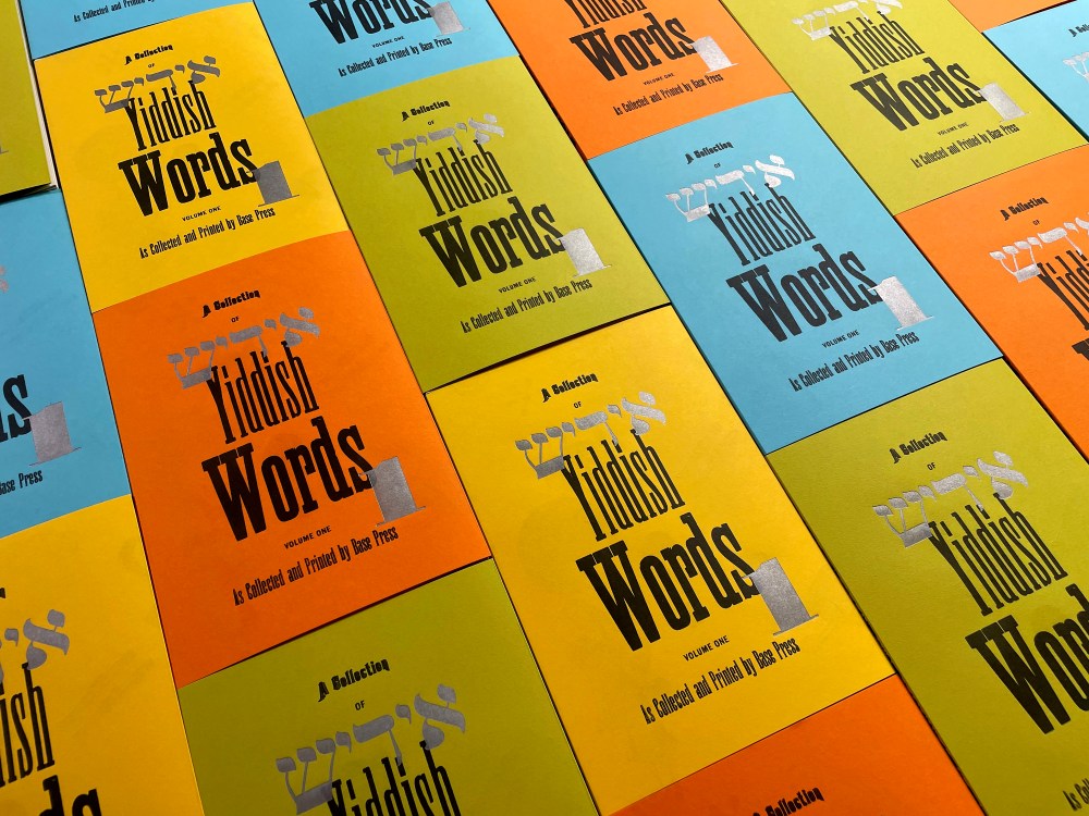
What America needs is a gute 5-cent tsigar, a spritz of 2-cent zeltzer and a vocabulary of choice Yiddishisms to make it through the day. Thanks to Frank Baseman of Base Press, A Collection of Yiddish Words, Volume 1 makes the latter available to all. Baseman has compiled and illustrated this delightful book (24 pages plus covers, endpapers and outerwrap)—typeset by hand, printed by hand with a Vandercook SP-15 and handsewn and coptic bound. Included are 20 choice Yiddish words using Hebrew wood type courtesy of the Yiddish Book Center in Amherst, MA.
Readers can purchase copies of this limited-edition offering at www.basepress.co—and below, Baseman talks about preserving the language and its coarse beauty. Thanks boychik.
Where did the inspiration in reviving colorful Yiddish come from?
My interest in Yiddish goes back to growing up within a Jewish household, mostly in the suburbs of cities near Cincinnati, Detroit, Chicago and Philadelphia. Within this household I would often hear some unusual words being spoken—a language being used—that I was completely unfamiliar with. My paternal grandmother (Esther Louise Troshinsky Baseman Barron) often spoke Yiddish words or phrases, and my parents did the same. Perhaps it was a secret language spoken aloud so the children didn’t know what the adults were saying. And so began my fascination with these curious words, that I only discovered were Yiddish when I was older. I have always identified as a cultural Jew: I identify with the culture, literature, food, history, comedy/humor of the Jewish experience more than the religion I was exposed to growing up.
After four decades as a graphic designer—and in the past nine years, becoming a letterpress printer—I now believe that I first came to graphic design through an ongoing and long-held interest in language and communication. And from my interest in language, began my deep interest in typography, specifically. I was drawn to using Yiddish as an extension of this interest in language, but also I thought I could have some fun with the subject matter—though finding suitable wood type to print with proved to be a bit of a challenge.
Do you speak or read Yiddish?
I speak a few words here and there within normal conversation, but no, I don’t speak or read Yiddish.
How large is the edition? And who is it intended for?
This letterpress book was printed and bound by hand in a limited edition of 6o copies. Of that total, 12 were made into case-bound books (hard cover) as an even more special edition. I’m hoping that the special (case-bound) versions will find their way into special collections at universities, colleges, etc. (which they have already).
As to audience and intention, the audience could be anyone interested in Yiddish culture or language, and/or anyone interested in letterpress printing. As to intention, I just wanted to make another book, and so I have. As a printer, I have the means of production to conserve some of my favorite Yiddish words in the form of this book, and to help preserve the language a bit for future generations. I have plenty of ideas still for future books, including a second volume of Yiddish words. We’re already on it.
There is a revival of Yiddish going on. The Yiddish Book Center on the campus of Hampshire College is one example. Are you a player in this revival?
If there was a revival of Yiddish going on I can’t really say that I was aware of it, and I’m definitely not a “player” in the revival—yet. Having said this, absolutely count me in for support. As to the Yiddish Book Center, the Hebrew wood type that I printed with actually came from the Yiddish Book Center, as the folks there were so kind and gracious as to let me use some of their type for my project.
One of the things I have greatly appreciated about the letterpress community writ large is the knowledge, experience, depth, kindness and support I have found within it. Once I decided to try to use Hebrew type within the book, I was faced with several options for where and how to work with Hebrew.
I initially digitally typeset the 20 words needed for the book after discovering Hebrew type specimens on the Cary Graphic Arts Collection at the RIT website. I could have made plates of this type, or I could have bought brand-new wood type from Virgin Wood Type. But I also began to track down some folks or places that might have some Hebrew wood type that I could use.
And in the end, I was introduced to Caleb Sher at the Yiddish Book Center through Noam Sienna, a Hebrew and Yiddish scholar, letterpress printer and early supporter of the project. Caleb and the folks at the Yiddish Book Center were actually eager for some of their type to see some ink. I just needed to find a local printer that I could print at, as I could not take the type back to my shop in Pennsylvania. I ended up printing at Big Wheel Press in Easthampton, MA (thanks to Bill Muller for letting me use his press for a week). Earlier in the spring and summer I printed everything else at my studio, and then took a road trip—a “printcation”—to Massachusetts with my tub of printed press sheets, and finished off the print runs with the Hebrew wood type printing in silver. It was my first time using a non-Latin font, and the type printed beautifully.
What determined which words you selected?
Quite honestly and understandably, I mostly gravitated toward some of my favorite Yiddish words, some that I use in regular conversation. I was attracted for the sheer sound of the word (“Shmegege,” “Ongeblozen”), others more for the meaning. And others because I have heard them my whole life (“Shmatte,” “Tsuris”). One of my favorites is “Mishpocheh,” which means “family,” and I do use that one quite a bit. There are some very obvious words included in this volume that have reached “regular English vernacular,” such as “Mensch,” “Shmuck,” “Shlock” and “Schlep.” And then there were some others that were more obscure, or even surprises—for instance I did not know that “Glitch” was a Yiddish word, but it is. And some were selected due to the visual potential of what I could do with certain words, either with definition or usage.
The post The Daily Heller: Tsuris Got You Down? Don’t Be a Putz appeared first on PRINT Magazine.