Typographic, edited by Edward M. Gottschall between 1970 and 1986 for the International Typographic Composition Association, was, modestly, one of the most practical and informative type journals in the U.S.—particularly during a time when production was evolving from metal to photo (and nudging into digital).
Gottschall was among the influential Postwar type industry advocates and historians, always with his finger on both vintage and current methods and styles. His editorial and promotional work with ITC, TGC, U&lc, and collaborations with the likes of Aaron Burns and Herb Lubalin, was unequaled. His landmark 1989 book Typographic Communications Today, although long out of print, remains a go-to guide, covering a broad span of 20th-century graphic design. The publication was designed by Mo Lebowitz, best known for the letterpress studio Antique Press.
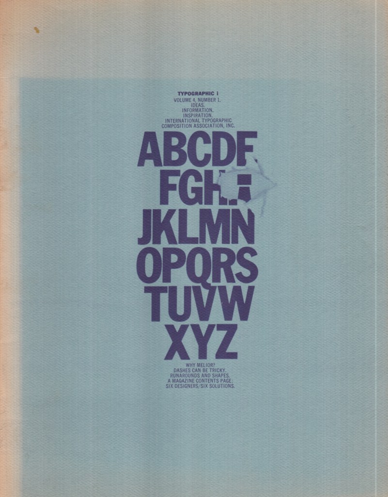
As noted on the website This Display, “Issues were printed in one color on various colored stocks and heavily illustrated throughout, featuring design- and typographic–related content, including: corporate identity, designer and project profiles, letterform studies, typeface and book reviews, typographic distinctions, type puzzles and more.”
The issue reproduced here is among the richest in my collection, and I’ve scanned it almost in its entirety. Within are Hermann Zapf’s Melior, once my favorite typeface; variations on designing a magazine’s table of contents, once my favorite task; mortising text type into shapes and patterns; the proper use of the dash in typography (not shown); and visual pun front and back covers. The pages were scanned to original size so you can read the instructive texts.
The post The Daily Heller: Variations on the Staples of Text Design appeared first on PRINT Magazine.