The Intuit Art Museum in Chicago is not your typical art museum. It specializes in showcasing what is called Art Brut (“raw art”) or “Outsider Art,” which are terms for works made by self-taught artists who don’t have traditional training or connections to the established arts scene. The Inuit Art Museum has been an important voice and figure in Chicago for 30 years, and recently called upon the Chicago-based studio Span for an elevated rebrand that reflected its unique POV.
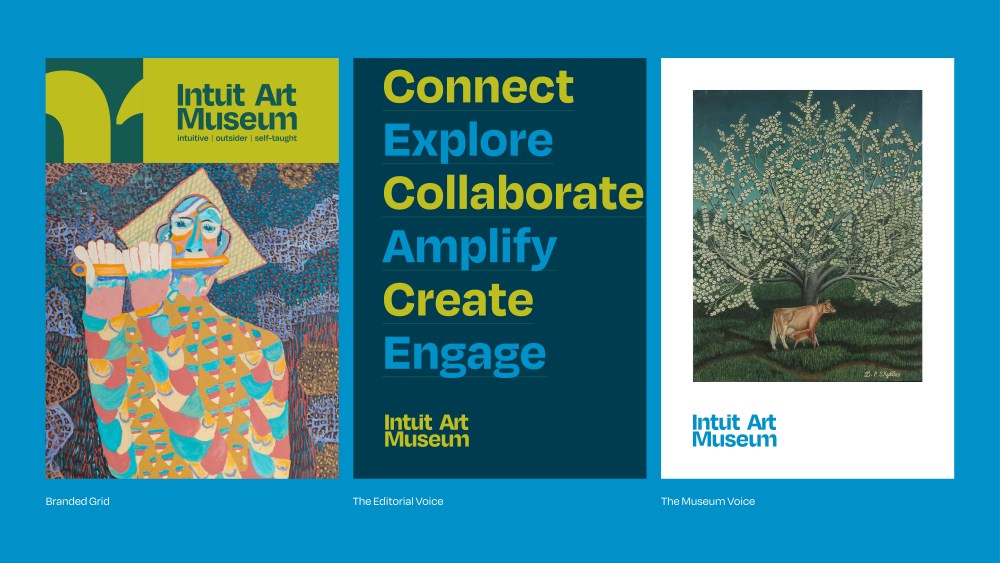
Not only did Span redesign Intuit’s brand, internal and external signage, marketing, and website, but they helped rename the museum as well. Formerly “Intuit: The Center for Intuitive and Outsider Art,” Span played a key role in developing a new name for the museum, along with a playful new look. The visual identity includes customized type and a set of graphics based on work of celebrated outsider artists like Minnie Evans, Lee Godie, Mr Imagination, David Butler and Nellie Mae Rowe. The result reflects the imperfect and hand-made quality of the art at Intuit, in contrast to the stuffy tone typically associated with museums.
Span partner and design director, Bud Rodecke, elaborates on the project below.
What was the brief Intuit came to Span with for this rebrand? What were their main goals?
Intuit Art Museum was undergoing a full building renovation, and wanted a brand update to coincide with that work. They were in the process of evolving the institution from a center to a destination museum, and needed a brand refresh that matched their scale and ambition.
As part of this request, they asked us to consider changing the name of the institution. Should they change their name? If so, how much change is needed? They wanted to welcome broader, younger audiences without alienating long-time supporters of outsider art. And they desired a flexible design system that could live on the building, website, merchandise and marketing.
In short, they wanted clarity, inclusivity and room to grow.
Not just rebranding an organization but renaming it entirely is a daunting undertaking. How did you go about tackling the renaming of Intuit? What was that process like?
While the shift from “Intuit: The Center for Intuitive and Outsider Art” to “Intuit Art Museum” may seem subtle, it was a carefully considered change.
Our naming exploration included: “Intuit” names that defined the genre, “Intuit” names that avoided defining the genre, acronym-based names, non-“Intuit” genre-defining names (e.g., self-taught), non-“Intuit” names inspired by genre attributes with a less conventional museum persona, and names that simply implied “leadership in the genre.”
It’s important to recognize that within both Chicago and the broader field of outsider art, Intuit has over 30 years of brand equity. The new name preserves this equity while signaling the institution’s transformation from a center to a museum— and offering greater flexibility for the future. By shifting genre descriptors out of the name and into a tagline or explanatory language, the identity gains the ability to evolve as conversations around the genre continue to grow and shift.
Intuit is a particularly unique art museum, given its focus on “Art Brut”/”Outsider Art.” What was it like tackling a rebrand for a museum with that distinct perspective? What were the main considerations that went into what you created given their Outsider Art POV?
It was a delicate balance to strike. Self-taught and outsider art resists tidy definitions. What unites these works isn’t a shared style or medium, but the singular perspectives behind them. The brand also had to balance respect for the genre and the museum’s raw, individual spirit with the “polish” visitors expect from a museum. We avoided anything too precious or institutional, leaned into what makes Intuit unique, and built space for stories that foreground the artists rather than the institution.
Can you elaborate on the idea of “Serendipitous Connections” that’s a connective tissue
throughout the brand system?
The idea captures the surprise of discovering an unfamiliar artist, and the way disparate
elements snap together in unexpected ways: visitor and artwork, letter and letter, sign and
architecture. Visually, this concept comes to life through custom ligatures in the wordmark and signage that projects from the wall, casting connecting shadows.
During our research phase, Donna Speigel, our brand strategy collaborator, identified recurring themes. In every exit interview, visitors described feeling surprised, learning something new, or experiencing a meaningful connection to the art and artists. Inspired by this insight, “serendipitous connection” became our branding north star— something the design communicates and, just as importantly, something the museum aspires to foster.
It creates an irreplaceable memory that lasts, and we seem to relish the retelling of those moments. You remember that person you just happened to meet, you remember that fabulous restaurant you just stumbled into, you remember that surprise and awe you felt finding that painting on the wall that just opened your eyes and activated something within you. Nothing would be the same if that connection had not happened. And it’s all as if it were meant to be.
With Intuit as the “facilitator” or “enabler” or “mentor” of these serendipitous connections, visitors can similarly bond with the museum in a more personal and meaningful way. The intimate feeling of the museum (even in its new larger space) and its welcoming atmosphere create the optimal environment for the wonder and sense of unexpected fortunate discoveries to occur.
Can you shed more light on your process developing and creating the new wordmark for Intuit?
Our design process is iterative and exploratory— we investigate a wide range of possibilities
before arriving at a final direction. In developing the new brand, we explored many ways to
interpret the institution’s voice and visual identity. While reviewing logo concepts with Marisa Cruz, she showed a version where the letters were fused together into custom ligatures. That idea immediately stood out, and we began refining it together.
Our first step was switching to Degular as the base typeface. Its dramatically tapered strokes
provided the perfect foundation for cutting and reconnecting letterforms into new ligatures. This particular direction emerged early in the process and remained a favorite. We continued to refine it until it felt just right.
Similarly, can you explain your process behind developing the suite of brand characters for the rebrand?
The previous brand featured a silhouette of a dog by Bill Traylor— an iconic form that had been part of the institution’s identity for many years. We wanted to honor that legacy while opening the brand to include the voices of other artists in the collection.
We combed through Intuit’s permanent collection and extracted small motifs from works by Minnie Evans, Lee Godie, Mr. Imagination, David Butler, and Nellie Mae Rowe. Each icon—angel wings, a butterfly, a dog—works as mascots for the institution.
What aspect of this rebrand are you proudest of?
This project, more than any I’ve worked on, truly touched every facet of the institution. We were able to completely transform Intuit’s visual identity, from the website (art.org) to the signage throughout the space.
Those who know the museum well have described the new brand as feeling “just right.” And
visitors—especially those new to outsider art—now say the museum “feels like it’s for me.”
Turning a specialized institution into one of the most welcoming museums in Chicago, while honoring its unique roots, is exactly the outcome we set out to achieve.
The post The Intuit Art Museum Gets a Quirky Rebrand by Span That Reflects Its Unexpected Offerings appeared first on PRINT Magazine.