Most great furniture doesn’t start with a grand vision. It starts with a sketch, usually a messy one, the kind you draw absentmindedly while thinking about something else entirely. Designer Deniz Aktay knows this. His latest piece, the Shift Sideboard, is proof that an unfinished line can sometimes carry more intention than a polished one.
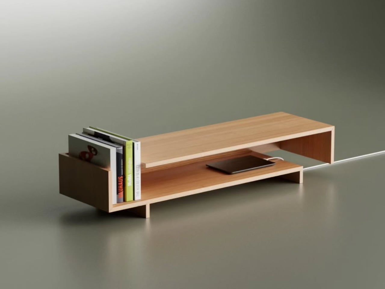
The concept is deceptively simple. Aktay began with a sketch of shifted, incomplete lines, the kind of drawing that would normally get torn out and tossed. But he saw something worth keeping in that incompleteness: a structural idea where two horizontal planes don’t fully align, each one sliding past the other, leaving gaps and openings that feel both accidental and entirely deliberate. That tension between intentional and incidental is what makes the Shift so visually compelling.
Designer: Deniz Aktay
Looking at it from the front, the sideboard reads almost like a typographic letterform. The upper shelf sits shorter, pulled to one side, while the lower platform stretches past it in the opposite direction. The result is a silhouette that feels like it’s mid-motion, caught between two states. It doesn’t try to be symmetrical, and that’s exactly why it works. Symmetry in furniture is safe. This is not that.
From a practical standpoint, those offset gaps aren’t just aesthetic choices. They translate into genuinely useful storage zones. Books stand upright in the open left compartment without needing bookends. A phone charges through a slot in the side wall, with the cable routed out cleanly through the offset gap at the edge, no cable box, no ugly workaround, no strip of tape pretending the cord isn’t there. For anyone who has ever stared at a tangled mess of cables on a media console and felt low-level irritation about it, this is the kind of thoughtful detail that earns real appreciation.
The material choice reinforces the whole mood of the piece. The warm, pale oak tones photograph beautifully against neutral backgrounds, and I imagine they read even better in a real room. There’s a quietness to it. The grain runs consistently across every surface, and the joinery is clean without being precious. It doesn’t have the cold austerity that some minimalist furniture falls into, the kind where you’re afraid to actually put anything on it. The Shift looks like it wants to be used, which is actually a harder thing to achieve than it sounds.
Aktay has been building a following for this kind of work for a while now, and he’s clearly found an audience that’s hungry for furniture that sits somewhere between concept and craft, pieces that look like they belong in a gallery but function like they belong in a home. His earlier work already hinted at this ability to make structure feel expressive without becoming theatrical. The Shift continues in that direction, but with more restraint. It feels more resolved.
My personal read on it: furniture that earns attention through subtlety is almost always more interesting than furniture that shouts. The Shift doesn’t need to be dramatic. The offset lines do the work quietly, and you keep noticing new things about it the longer you look. The way the shadow falls differently on each side. The way the open compartment frames whatever you put inside it. The way the cable route makes a modern inconvenience feel like it was part of the design from the beginning, because it was.
That last part matters more than it gets credit for. Cable management is often an afterthought, tacked on at the end of a design process with a grommeted hole and a prayer. Building it into the structure itself, as a consequence of the form rather than a patch over it, is the kind of decision that separates a design exercise from something you’d actually want to live with. The Shift Sideboard started as an unfinished sketch. Right now, at least conceptually, it feels very finished indeed.
The post The Sideboard That Started as Lines That Never Finished first appeared on Yanko Design.