There’s something deeply satisfying about watching a 1960s industrial shed get reimagined into something else without losing its gritty soul. Most warehouse conversions follow a predictable script: gut the interior, white-wash everything, add some Edison bulbs, call it industrial chic. Zen Architects took a different approach with this Richmond project, and the result feels less like gentrification and more like intelligent conversation between past and present. The brief was straightforward enough, but the execution required actual restraint, which is apparently a rare commodity in Australian residential architecture these days.
The project sits on Wurundjeri Country in Melbourne’s inner suburbs, and the decision tree here was fascinating from the jump. Keep the existing building envelope or tear it down and start fresh? Retain that brutalist concrete slab or rip it up? Truewood Constructions worked within some seriously constrained site access, which actually forced better decisions. When you can’t easily demo and haul away a concrete floor, you start thinking harder about embodied energy and lifecycle assessments. The slab stayed, the steel structure stayed, even the original sprinkler pipes and light fittings got repurposed. This is adaptive reuse that actually adapts rather than apologizes for existing.
Designer: Zen Architects
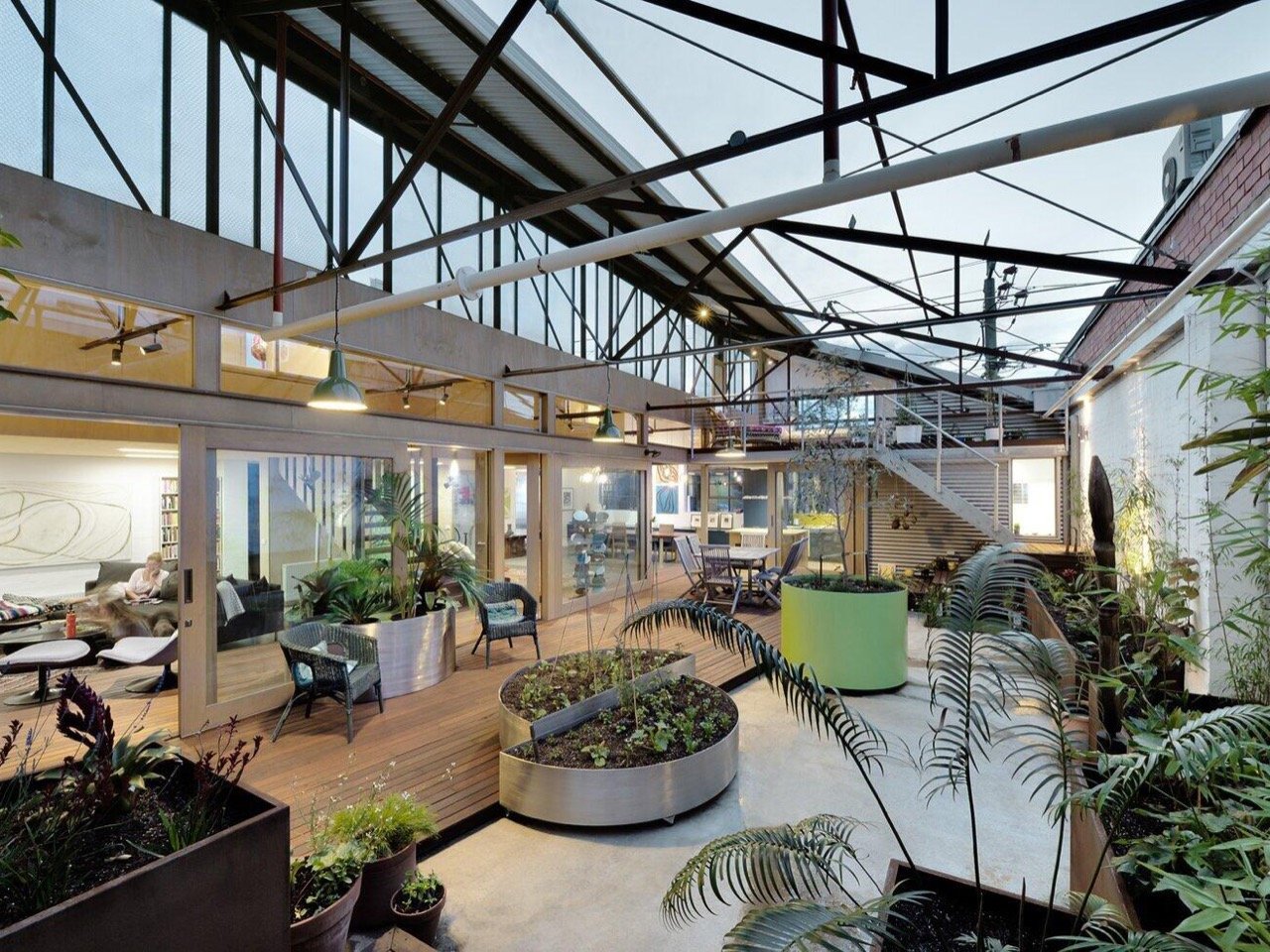
The spatial solution centers on a north-facing courtyard that punches through what was essentially a light-starved box. This internal garden does the heavy lifting thermally, pulling winter sun deep into the plan while those new high-level louvres handle cross ventilation. The warehouse’s original orientation was terrible, south-facing with minimal useful glazing, so rather than fighting the envelope they carved out a microclimate inside it. Those floating mezzanine rooms sit within the original volume like furniture, maintaining that cathedral ceiling while creating actual bedrooms. The exposed steel truss system reads as pure structure, painted dark to recede visually while the translucent roof panels filter daylight through the framework. It’s a sectional move that respects the building’s bones while completely reorganizing its guts.
What makes this work spatially is that raised timber deck threading through the concrete floor plane. Living areas sit lower on polished concrete, dining and circulation happen on the warm hardwood deck, and the courtyard becomes this interstitial garden space that belongs to everything and nothing. Those circular planters, particularly that lime green cylinder, are mobile on casters. The planting strategy mixes small trees with ferns and tropicals, creating enough density to make the courtyard feel like actual garden rather than decorative garnish. Emma Cross’s photography captures how the double-height volume and layered transparency create sightlines that connect every zone, living room to mezzanine bedroom, without compromising privacy.
The interior palette is an exercise in restraint. Deep teal cabinetry with a yellow backsplash accent in the kitchen, natural plywood for the mezzanine boxes, and that polished concrete everywhere else. The lighting mix spans industrial green enamel pendants, colorful glass spheres over the dining table, and black track fixtures on the exposed structure. No fussy chandeliers or Pinterest-core fixtures trying too hard. The furniture reads eclectic without feeling curated to death, a rustic timber dining table with visible character, black sectional sofa, some mid-century modern pieces, kilim rugs. It looks like people actually live here, which is apparently controversial in architectural photography.
The sustainability angle matter here even if Zen Architects didn’t scream it from the rooftops. That existing concrete slab represents thousands of kilograms of embodied carbon that stayed in place. The reused roof sheeting, cladding, and original fixtures add up to significant material waste diverted from landfill. High-level louvres and the north courtyard provide passive heating and cooling, reducing mechanical system loads. This is sustainable architecture that doesn’t need to wear a solar panel costume to prove its credentials. The performance is embedded in the planning decisions, the material reuse, the thermal mass of that concrete floor soaking up winter sun and releasing it overnight. It’s almost like good design and environmental responsibility can coexist without PowerPoint presentations about green washing.
The post This 1960s Warehouse-turned-home retained its concrete floors, steel roofs, and grunge aesthetic first appeared on Yanko Design.