Lamborghini’s relationship with Formula 1 has always been complicated. The brand briefly dipped its toes into F1 waters between 1989 and 1993, first as an engine supplier to teams like Lotus and Larousse, then with their own short-lived Lambo 291 chassis in 1991. The results were mixed at best, with the Italian manufacturer’s best finish being a 7th place, and the project was quickly abandoned after just six races. Today, Lamborghini CEO Stephan Winkelmann remains adamant that F1 “is not part of our idea for the future,” citing the lack of connection to street-legal cars.
But what if Lamborghini did have an F1 team? Designer William Almkvist has crafted a conceptual livery that answers that question with stunning visual authority. His design doesn’t just imagine Lamborghini in F1, it creates a complete brand identity that feels both authentically Lamborghini and perfectly at home on the grid. The result is a livery that manages to be stealthy yet aggressive, premium yet purposeful, and distinctly Italian while respecting F1’s technical requirements.
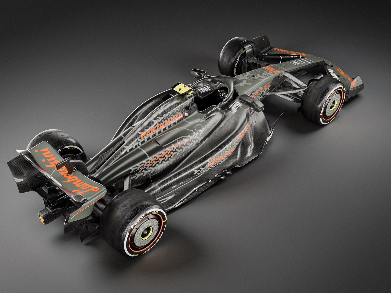
Designer: William Almkvist
The most striking aspect of Almkvist’s design is the decision to make carbon fiber the star of the show. Where most F1 liveries rely on bold paint schemes, this concept lets the raw weave do the talking. The carbon fiber texture covers nearly the entire chassis, creating a finish that’s part stealth bomber, part hypercar showcase. It’s a move that immediately connects the F1 car to Lamborghini’s road car philosophy, where exposed carbon has become a signature element on models like the Sesto Elemento and Centenario.
Orange accents punctuate the carbon landscape with surgical precision. The color choice is pure Lamborghini DNA, echoing the Arancio Borealis and similar hues that have defined the brand’s boldest road cars. These orange elements appear on sponsor logos, the iconic script “Lamborghini” lettering on the rear wing, and subtle details throughout the car. The restraint shown here is impressive, the orange never overwhelms but always commands attention when it appears. Compare this to McLaren’s use of papaya orange, which dominates their entire livery, Almkvist’s approach feels more sophisticated and premium.
The hexagonal Y-pattern running along the car’s spine and sides represents the design’s most clever touch. Any Lamborghini enthusiast will recognize this motif from the brand’s interior design language, where it appears on everything from seat stitching to dashboard panels to taillights. Translating this signature element to a racing livery creates an instant connection between the F1 car and the brand’s road car heritage. The pattern is rendered in graduated gray tones, providing visual depth without creating chaos. The directional flow of these graphics emphasizes the car’s length and speed, even when stationary.
Sponsor integration demonstrates a masterclass in brand hierarchy. Pertamina gets prime real estate as the title sponsor, with their logo appearing multiple times in crisp white lettering. Roger Dubuis, OMP, Akrapovič, and other partners receive strategic placement without cluttering the overall design. The decision to render most sponsor logos in white or orange maintains visual cohesion while ensuring readability. This approach feels refreshingly clean compared to some modern F1 liveries that resemble NASCAR-style sponsor collages.
The technical details reveal Almkvist’s understanding of contemporary F1 regulations. The car features the complex aerodynamic elements required by current rules, broad sidepods, intricate bargeboards, and multi-element wings. The Pirelli tire branding includes proper color coding for compound identification, with orange and yellow sidewall markings that any F1 fan would recognize.
What makes this concept particularly compelling is how it balances Lamborghini’s street car aesthetic with F1’s technical requirements. The exposed carbon fiber and hexagonal patterns create clear brand connection, while the overall layout respects motorsport conventions. The livery would stand out dramatically on the grid while maintaining the sophistication expected from a luxury brand. Soft, neutral lighting highlights the carbon fiber’s texture and the orange accents’ vibrancy without creating harsh shadows. The gradient gray background keeps focus on the car itself, a smart choice that lets every design element breathe.
Looking at this concept makes you realize how sanitized and corporate most current F1 liveries have become. This design has personality, it takes risks, it makes visual statements that go beyond optimal sponsor visibility metrics. Would it work in the real world of F1 politics and commercial pressures? Maybe not exactly as shown, but it proves that Formula 1 livery design doesn’t have to be boring. Sometimes the best concepts are the ones that make you wish they were real.
The post This Stunning Lamborghini F1 Concept Makes Every Other Livery Look Boring first appeared on Yanko Design.