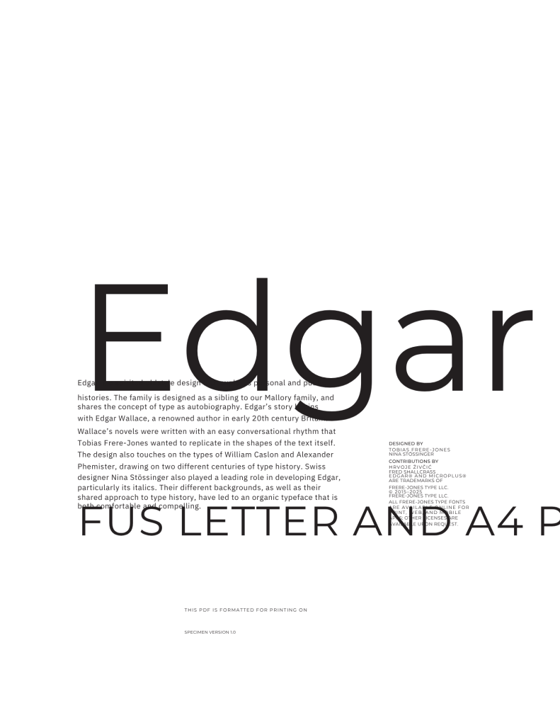
Tobias Frere-Jones needs little introduction. He’s one of the world’s leading type designers and educators, having created indelible typefaces woven into our visual lexicon: Community Gothic, Whitney, Gotham, to name just a few. Ten years ago, he started his namesake foundry, and with its founding, he released its first retail typeface, Mallory. At the time, Frere-Jones called the sans serif “a personal experiment in dual citizenship.” He had the idea for a companion typeface, but it needed some time to marinate. That typeface, Edgar, debuts as Frere-Jones Type celebrates its tenth birthday. As Mallory’s serif sibling, Edgar is also a study in what Frere-Jones calls “type as autobiography.”
There’s always some kind of trace of me and how I think and what I’ve seen.
Tobias Frere-Jones
I recently spoke to Frere-Jones about the anniversary and the release of Edgar. Behind him was a wall of books. There’s no more fitting picture of Frere-Jones’ craft, in which he wields a researcher’s sensibility and a curiosity about history (and how he intersects with it). Everything he creates is deeply, personally resonant.
I love this quote from this excellent blog post on the design of Edgar by Emily Gosling. Frere-Jones says, “This unlikely combination of historical sources can be useful as a source of dissonance, tension, and energy: in some typefaces, letterforms will grind against each other, but in a positive way. There’s a kind of controlled noise. It’s like the dissonance becomes the harmony.”
As for sources, Edgar gets its name from Frere-Jones’ great-grandfather, Edgar Wallace, a well-known British journalist and crime writer who worked around the turn of the 20th century. The foundation for Edgar drew on two type icons separated by 150 years: the 18th-century engraver William Caslon and the Scottish typographer and punchcutter, Alexander Phemister. The latter provided the spark for Edgar’s italics.
Mallory was, from the beginning, a typeface chameleon for many different use cases, and “it was pretty clear where the path led,” said Frere-Jones. Edgar’s vision was more defined: a book typeface for extended reading, requiring more time, research, experimentation, and collaboration. Frere-Jones admits that he could only see “one corner of the family” when he began work on it. “I had the Roman and an idea of what it might be in italics, though not all the italics, and certainly none of the heavier weights,” he said. Edgar’s expression at heavier weights defined “the struggle” of the last months of development.
Frere-Jones spoke candidly about the challenges of juggling client work with retail typeface development, specifically Edgar. The ability to start something, then set it aside to revisit it later with fresh eyes, is a benefit of retail projects, says Frere-Jones, a luxury you don’t have with customer projects. “In this case, we came back to Edgar and realized the flavor wasn’t quite right. It didn’t go heavy enough. So, I started the whole bold, black end of that family over from scratch, which is an alarming thing to do, but it definitely turned out better for that.”
He likens the act of designing a type family to writing a story, in that the end can often clarify the beginning. “If you’re not sure how the story is beginning, the end will show you what the beginning ought to be; it’s the same thing in working out a family,” he says.
Frere-Jones worked closely with Swiss-born type designer Nina Stössinger (who joined FJT in 2016), who injected her own reference points and personal flavor. It’s the “constructive tension” in the process, the historical type sources, the collaboration between designers, and the personal history that make a typeface a Frere-Jones typeface. Referencing this tension, he said that it provides “a kind of source of energy and also a kind of a tool to solve problems, whether they’re visual or organizational or philosophical. It creates opportunity.” It also makes the output much more human and emotionally resonant.
He references a lecture by Matthew Carter, who spoke about drawing from historical sources, saying you must add something of yourself; without that, you’re basically practicing taxidermy.
When I asked Frere-Jones about his hopes for the next ten years of Frere-Jones Type and of the design industry overall, he is the ultimate optimist. “The technology is intriguing,” he said. “But the thing I’m looking forward to the most is the ever-rising sophistication of the readers and users, because that’ll be the thing that allows us, encourages us, to do more and be more.”
Looking back on the last decade, he said, “I’m tremendously proud of what we’ve built here, and the work that we’ve done, not just through the retail family, but the commissioned work as well.” They have a long list of retail typefaces waiting in the wings, though, he admits, “the hard part is figuring out which one to do first.”
Expect the next typeface out of Frere-Jones Type, developed by Nina Stössinger, later this year.
The post Tobias Frere-Jones Looks to the Past With Optimism About the Future appeared first on PRINT Magazine.

