Typography people know this truth: the best type design is everywhere—and almost invisible. But every so often, opportunities like the PRINT Awards pull those letterforms into the spotlight and remind us who is behind the craft. Over the years, standout designers and studios have shaped the field in ways that feel both timeless and forward-looking.
With the final (YES, FINAL) day to enter the 2026 PRINT Awards today, we thought we’d use the Type Tuesday column to take a dive into the archives and shout out some of our favorite type designers who were recognized for their stellar work as PRINT Award honorees and in the pages of PRINT Magazine. Whether the work is recent or from what feels like yesteryear, typography has always had a special place in our world and the designers we’ve recognized have always put their best work forward for their clients, colleagues, and the PRINT audience from around the world.
The Year Was 2016
Called out by PRINT contributing writer Jason Tselentis as one of the best typefaces of the year in the fall of 2016, double-threat, Operator Mono Designed by Hoefler & Co. by Andy Clymer, Jordan Bell and Troy Leinster; artistic direction by Jonathan Hoefler is a monospaced (fixed-width) face that the judges explained was “great for coding,” and its “natural width” companion Operator as suitable for a broad range of design uses.
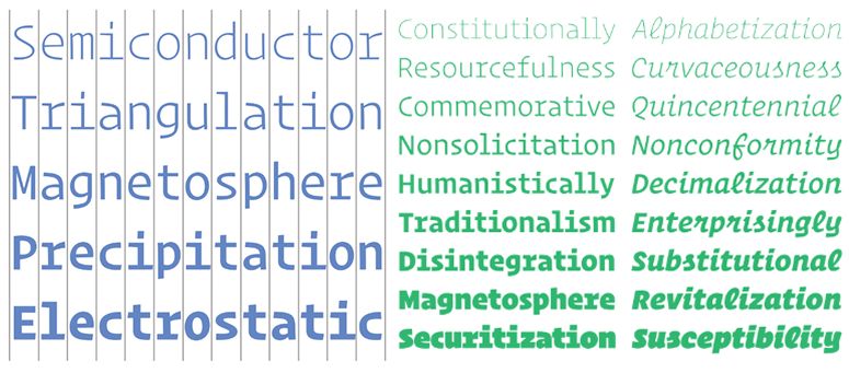
That same year, Classic Grotesque made the cut as one of the best of the year. Designed by Rod McDonald for Monotype, it was a revival of the original with 42 new weights and 56 styles.
There are so many great new sans serif typefaces, but how can you wrong when using Classic Grotesque? It saves the wonkiness of Monotype Grotesque by refines the forms to be legible in text–so much warmer than that chilly Helvetica or Univers.
Sean Adams (current Dean of Visual Studies at ArtCenter College of Design)
Four Years Before
Going back to 2012, Paul Shaw and Stephen Coles selected six American typefaces in their column for PRINT called Stereotype.
Eleven Years Later
The Editors’ Choice selection for the PRINT Awards in 2023, was a stunning type project from Rozi Zhu. Ferrofluid is a liquid which becomes highly magnetized in the presence of a magnetic field. The Ferrofluid Type is designed and presented through a display interface, which is made up of Arduino boards, 5×5 electromagnet matrix, relays, a power supply, and a glass container with ferrofluid. All the letters and motions are controlled through this installation using code and physical computation.
In 2025, My-Lan Thuong of Sharp Type took home third place in the PRINT Awards for Rosalie a refined display serif is the result of years of meticulous development, balancing aesthetic precision with a deeply intentional character set. Inspired by a medieval mural in Guérande, France, the typeface explores striking polarities—merging historical references with contemporary sensibilities, sharp angles with soft curves, and calligraphic elegance with structural clarity.
Type design is one of the few disciplines that quietly shapes almost every human interaction—every headline that grabs attention, every interface that guides us, every word that carries meaning from one person to another. It is both infrastructure and expression, logic and emotion, invisible and unforgettable. To design type is to shape language itself, to influence how ideas are seen, felt, and remembered. That’s why it deserves to be recognized, shared, and celebrated. Entering the PRINT Awards isn’t just about winning—it’s about placing your work in that larger conversation, where craft meets culture and where your letters, quite literally, have the power to move the world.
The post Type Design—Then, Now and 4EVA appeared first on PRINT Magazine.