It’s been 35 years since the Americans with Disabilities Act became federal law, improving the accessibility of our public spaces, from travel to employment to how we build our cities. The legislation also brought greater awareness to the daily challenges of living with a disability, helping raise our social awareness and consciousness. But our collective empathy seems to be waning. Terms like access and inclusivity are often slapped with the “woke” label without context. Our digital lives separate us from the plight of others, making it harder to disavow ourselves of our misconceptions.
We take our everyday lack of friction for granted. We read signs, hear our environment, and move our bodies without mobility devices or service animals; these things don’t become conscious unless they are taken away. Unless we can experience the world through someone else’s lens.
Design can be that lens.
Design is stepping up and proving to be a model for how we can build empathy for others whose experience diverges from our own. Through design, we can inhabit someone else’s shoes, from living with disabilities to the everyday challenges stemming from a debilitating diagnosis.
Eillish Briscoe’s Maybe typeface was one such example from last year. After a stroke at the age of 25, the London-based designer created Maybe to reflect the act of re-learning to write. There’s an excellent feature in It’s Nice That that goes into Briscoe’s story and process. More recently, Olivia King released Inclusive Sans, a typeface with three years of research on readability and accessibility as its foundation, a project I covered just last week in this column. Other typefaces, such as Atkinson Hyperlegible (low vision) and Zed (low vision and marginalized linguistic communities), also belong in this conversation.
But I want to showcase three recent type-centered projects that model how type can express a greater empathy for the diversity of human lived experience.
Silent Shake
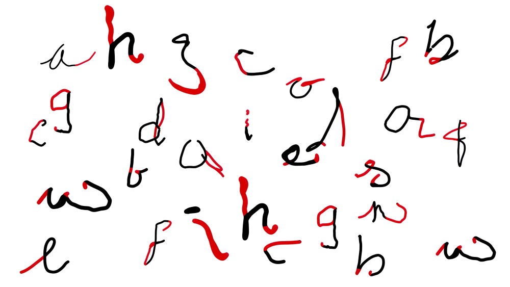
This student-led type project was inspired by the early detection of Parkinson’s disease. Parkinson’s starts with subtle tremors and movement changes that don’t interfere with daily activities, but as it progresses, debilitating stiffness often necessitates confinement to a wheelchair or bed. Understanding the signs and early intervention by a doctor can be key to long-term management of symptoms.
Designed by Leeds University students Hollie Spooner, Lizzie Day, and Katie May Charlesworth, Silent Shake is a typeface that expresses the subtle handwriting changes seen in the early stages of the disease. It’s part educational tool (visualizing the typical handwriting irregularities associated with the onset of the disease: letter gaps, extended lines, and diminishing letter sizing, or micrographia) and an early prevention tool (identifying subtle early signs that might otherwise go unnoticed). For inspiration and research, the students turned to an unlikely place: birthday cards (one of the last places we still see handwriting in our digital-first world).
“Silent Shake,” 2025 D&AD New Blood Award Black Pencil winner. See D&AD for more details.
Spooner, Day, and Charlesworth analyzed handwriting supplied by 32 people who have loved ones with Parkinson’s. In addition to the typeface, the team designed a Keep-Safe Card as a portable reference guide for early detection.
[Silent Shake] wasn’t just design. It was emotional resonance through type.
Sue Daun, Interbrand creative director & D&AD New Blood Awards judge
“Silent Shake,” 2025 D&AD New Blood Award Black Pencil winner. See D&AD for more details.
Silent Shake won the Black Pencil award in D&AD’s New Blood Awards. The program’s Monotype-sponsored brief challenged young creatives to “explore how type design navigates moments of freedom, conflict, and control.” Of the winning entry, Monotype said that “by transforming these changes into visual storytelling, the campaign turns typography into a tool for empathy, diagnosis, and awareness.”
Ripple Migraine Care
Migraines are debilitating. They are one of the most common neurological disorders, affecting more than a billion people across the globe each year, and are especially common in young adults and females.*
“The current market for migraine treatments,” said designer Sarah See, “is dominated by sterile, unapproachable, medicalised products.” When the new migraine care and prevention brand, Ripple, tapped the London-based designer and art director to design a new brand identity, See wanted to approach it differently, by intimately connecting with the audience.
See’s inspiration for the wordmark was drawn from a physical aspect of the migraine experience. The aura effect can blur and distort the sufferer’s vision. Experienced by 20% of migraine sufferers, it is often an early symptom and warning sign of a burgeoning migraine. The aura effect felt like the perfect connection with Ripple’s prevention mission, and See distorted the logo wordmark to mimic the effect. The design of the wordmark also visually connects the brand name.
The photography was another aesthetic choice, and focuses on another key area of pain for migraine sufferers: the eye. Having the subject look directly at the viewer hits home this point, but also invites the viewer in. Migraines can be socially isolating, so it was essential to Ripple that they connect with people on an intimate level and cut through any social or cultural barriers. Ripple sees you.
*Migraine: A Review on Its History, Global Epidemiology, Risk Factors, and Comorbidities. Front Neurol. 2022
4,4,4&2
4,4,4&2 is a novel literary work that blends storytelling, memory, and time. The book is the latest release from boom saloon, a nonprofit global media movement based in Edinburgh that explores the UN’s Sustainable Development Goals through creativity. 4,4,4&2 uses an innovative disappearing ink, which fades day-to-day to mirror the cognitive changes of the brain that can occur with dementia.
Co-authored by Maggie Watson, diagnosed with Alzheimer’s and Vascular Dementia in 2021, the book is part photo album, personal ephemera such as recipes and notes, poetry, and memoir. “Each copy uniquely fades, warps and jumbles differently,” says boom saloon founder and editor, Rachel Arthur, “so each reader receives a wholly personalised experience to mirror the individual journey undertaken by those with a diagnosis.”
Dementia is a difficult diagnosis for the patient and the family, yet its portrayals are often clinical and overly sentimental. 4,4,4&2 offers a different experience of the journey for families, one of beauty, ambiguity, and humanity.
There’s a sense of loss, yes; but also resistance.
Rachel Arthur, boom saloon founder and editor
It’s a book, but also a call to action, says the publisher. “A challenge to see beyond the statistics and the medical jargon, to listen to the voices of those living with dementia and recognise the person behind the diagnosis.”
boom salon has also published two experimental anthologies of those living with dementia, Word Play and In the palm of a spider’s hand.
Publication photography by Victoria Vereska; photography of Maggie is by Kajsa Wingerup.
Header image: “Silent Shake,” 2025 D&AD New Blood Award Black Pencil winner.
The post Type Steps Up as a Model for Empathy & Inclusivity in Our Everyday Lives appeared first on PRINT Magazine.