As a kid, I would spend hours in Microsoft Paint sketching what I thought were pixel-perfect purple dolphins and my own sticker designs. A few years later, I was introduced to Clippy and WordArt, and suddenly, Microsoft Word wasn’t just for book reports; it became a creative playground for binder designs and birthday invites. Being a 90s kid, Microsoft was my constant companion, threaded through early creativity, awkward adolescent presentations, and the thrill of getting your first Hotmail address — you know the one — that your 13-year-old mind thought was cool; discochick00@hotmail.com anyone? So when brand and digital studio Koto released Microsoft’s 50th Anniversary identity, I excitedly braced for nostalgia and got something much richer.
Rather than lean into sentimental retrospection, Koto’s work reframes Microsoft’s legacy through the lens of makers: those who shaped, built, and dreamed across five decades. The strategy, anchored in the phrase “Change needs makers,” doesn’t just look backward; it invites the next generation to join in the making. And in doing so, it reclaims Microsoft’s brand not just as a tech platform, but as a creative force rooted in empowerment.
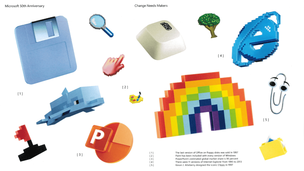
The campaign is built on a dynamic, modular identity system that feels alive. Visual compositions move between three main structures: “Worlds,” “Iconic Moments,” and “Then & Now.” These are less design gimmicks and more storytelling tools. “Worlds” places people at the center of richly imagined environments, surrounded by products and ideas that shaped their creativity. “Iconic Moments” looks back on milestones, such as the launch of Xbox or the first versions of Windows, not as static achievements but as cultural shifts. And “Then & Now” plays with time, pairing historic innovations with today’s breakthroughs to show a brand that never stopped evolving.
This identity system is distinctly Microsoft in tone but unmistakably Koto in execution; expressive, intentional, and full of movement. Typography plays a big role in keeping it grounded: Segoe Sans Display, Microsoft’s familiar typeface, lends continuity and clarity while subtly signaling evolution. And the six heritage-inspired gradient backgrounds used across the campaign are pure energy — warm, modern, and unified without feeling uniform.
What makes this work resonate isn’t the polish. It’s the pulse.
But what makes this work resonate isn’t the polish. It’s the pulse. Koto smartly avoids the trap of building a retrospective shrine. Instead, the design lives in the present and points toward the future. From a reimagined 50th-anniversary logo that riffs on the original Windows mark to playful digital artifacts used in motion and 3D, every detail feels purposeful and people-centered. The campaign spans digital platforms, physical signage, internal comms, and real-world activations, proving that even the most tech-centric brands still live and die by how human they feel.
This campaign had to honor Microsoft’s legacy without feeling nostalgic for nostalgia’s sake.
Cassidy Moriarty, strategy director at Koto
As someone whose earliest interface with technology was through a Windows desktop, this campaign hit differently. It reminds me how much design, particularly brand identity, can shape the way we understand legacy. Microsoft isn’t waxing poetic about its past; it’s inviting us to help write what’s next. Cassidy Moriarty, Koto’s strategy director, put it best: “This campaign had to honor Microsoft’s legacy without feeling nostalgic for nostalgia’s sake.” That’s exactly what they pulled off.
What’s most impressive here is the clarity of voice. Whether you’re a Millennial who remembers Encarta or a Gen Z creator using Copilot, the identity bridges time without pandering. It balances reverence with relevance. And it serves as a blueprint for how major brands can celebrate a milestone without turning it into a museum exhibit.
In a sea of anniversary campaigns that often feel like corporate scrapbook pages, Microsoft’s 50th stands out for its vitality. A reminder that the tools of change are in our hands, and always have been.
The post Windows, WordArt, & What’s Next: A 90s Kid Reflects on Microsoft’s 50-Year Brand Evolution appeared first on PRINT Magazine.