As platforms become infrastructure, rebranding them becomes less about reinvention and more about responsibility. YouTube’s new identity arrives at a moment when platforms must decide whether they shape culture or simply chase it.
This year, YouTube turns 20, and the company has unveiled a new global marketing identity — developed in-house by YouTube Creative Studio — that reflects its evolution from a video-sharing platform into a fully fledged entertainment brand. Designed to unify its expanding ecosystem, including Shorts, Music, TV, Premium, and Kids, the refresh introduces a cohesive framework intended to reconnect a brand that now lives everywhere audiences do, without losing its cultural center.
Over time, YouTube’s sub-brands, design languages, and tones of voice had grown in parallel, each optimized for its own context. The challenge, according to the team, wasn’t to flatten those differences, but to bring them back into alignment; to create a system that could feel unified without becoming rigid, expressive without becoming fragmented. “When a brand lives everywhere, it risks feeling like nowhere,” says Kieran Mistry, who led the project during his tenure at YouTube’s in-house Creative Studio EMEA. “Our task wasn’t to reinvent YouTube, but to design a system that connects its many sides — unified but never uniform”.
When a brand lives everywhere, it risks feeling like nowhere.”
Kieran Mistry
The strategic anchor for the work is a deceptively simple idea: Alive. Because content is YouTube’s heartbeat, the team recognized that the brand could no longer sit outside of it. Instead, it needed to move with it; reacting, shifting, and responding in ways that mirrored the spontaneity and humanity of the platform itself. That thinking shaped every design and motion decision, resulting in a system that feels dynamic rather than declarative, human rather than imposed.
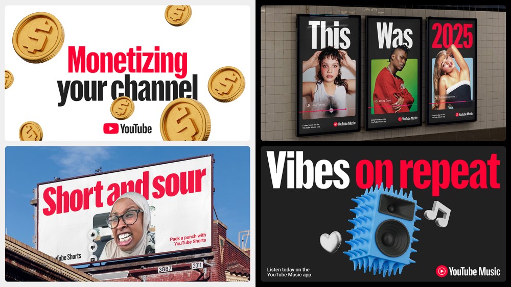
Notably, the refresh resists the temptation to start over. YouTube’s most recognizable assets, the red, white, and black palette, the play bar, familiar UI cues, and the cultural shorthand of “like, subscribe, share”, remain intact. Rather than replacing them, the system re-energizes them, giving existing elements greater range, personality, and expressive capacity while preserving the equity that made them iconic in the first place. As Mistry puts it, “YouTube didn’t need to throw everything out and start again — it’s already a cornerstone of the internet. Our job was to evolve what people know and love, and make it feel expressive and connected for what’s next”.
One of the most significant additions is YouTube Display, a custom display typeface developed in collaboration with Sharp Type. Built directly from the equity of the YouTube logo, the typeface provides a consistent yet flexible voice across all touchpoints. Crafted in nine global scripts, it reinforces brand recognition while allowing for nuance across markets, an essential consideration for a platform whose reach is inherently global.
Illustration has also been elevated from accent to system. Developed in collaboration with Gesture Systems, the new illustration style balances clarity with character, designed to feel both iconic and alive. Simple, bold, and confident, yet playful and curious, the illustrations echo the diversity and unpredictability of the content they support, while remaining unmistakably part of the YouTube ecosystem.
Perhaps the most defining evolution is YouTube’s first formal motion identity. Motion behaviors such as “Camera Shake” intentionally mimic natural camera movement, reflecting the rhythm of real content rather than imposing a manufactured smoothness. Motion here functions as language, not ornament, capturing the energy, immediacy, and humanity that have always driven the platform’s success. “The brand isn’t static anymore,” says Matt Saint, who led design alongside Mistry. “It reacts to real content and culture, evolving alongside new products, technologies, and audiences as YouTube continues to grow”.
The brand isn’t static anymore.”
Matt Saint
Flexibility was central to the system’s design. Each product within YouTube’s growing family still needs to speak meaningfully to its specific audience, but now does so within a shared framework that reinforces connection rather than competition. The result is an ecosystem that feels coherent without being constrained, one that is capable of evolving as quickly as the culture it reflects.
That this work was created entirely in-house is also significant. “Creating this in-house has been incredibly rewarding,” says Mistry. “It’s shown what’s possible when a small, close-knit team works with focus and belief, building a system that’s not just beautiful, but genuinely useful for everyone who touches the brand.” Saint echoes that sentiment: “This was never about decoration. It’s about creating a design system that works — uniting YouTube’s ecosystem and empowering teams everywhere to build from it confidently”.
As the new identity rolls out globally, from New York to Mumbai, Kyoto to London, it marks a defining moment for YouTube. At 20 years old, the brand is no longer chasing novelty. Instead, it is designing for continuity, responsiveness, and cultural fluency; proving that when a brand truly understands its role in the world, evolution doesn’t require disruption. It simply requires staying alive to the people, stories, and creative energy that made it matter in the first place.
The post YouTube at 20: Designing a Brand That Lives With Culture appeared first on PRINT Magazine.